A scatter plot, also known as a scatter chart, scatter graph, or scattergram, is a data visualization technique that shows the relationship between two variables.
It also stands out as one of the most frequently used charts among line graphs, pie charts, etc. Why? Reasons are simple: easy to understand, displays irregular or curved data points as opposed to linear data in most, and provides a statistical means to test the relationship strength between two variables.
The best part? Creating it isn’t rocket science. In this guide, I’ll walk you through the step-by-step process of how you can create, customize, and add trendlines to a scatter plot. So, without further ado, let’s dig in!
Making a Scatter Plot in Google Sheets
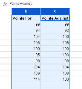
First, structure your data properly. Organizing and structuring the data holds priority to establish clarity in the graph and make it easy to understand.
Here are the guidelines for structuring your data:
- Place your data in columns, with each column representing a variable. Input the independent variable (x-axis) in the first column while the independent variable (y-axis) in the second.
- On top of each column, include a header row. These remain as axis labels in your scatter plot.
- Ensure the data type in each column is consistent to avoid any plotting issues.
- Do not keep any rows or columns blank, as it results in misleading or inaccurate representations.
- If required, sort your data according to the independent variable for your scatter plot to display a clear pattern.
- If you need any of your data to stand out, add a column for labels. It will highlight them in your plot.
- Make sure to keep a consistent and clear formatting to enhance visual clarity.
Now that your data is structured properly, it’s time to create. Here’s how:
- Highlight the columns you want to determine the relationship between by holding Shift and left-clicking the column names.
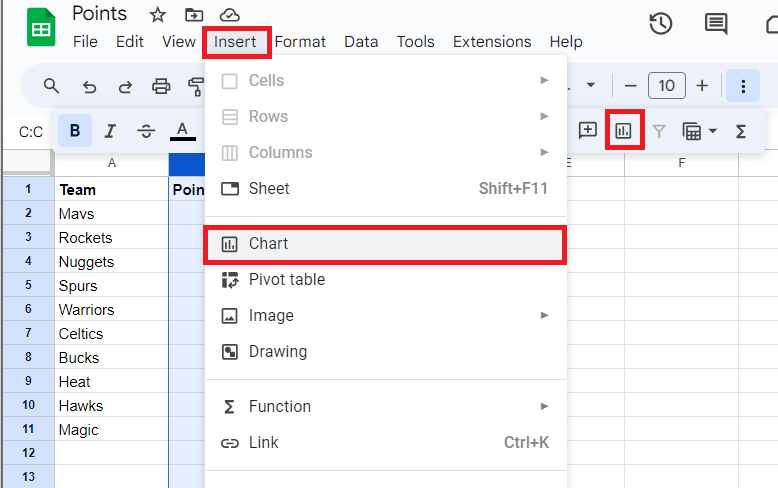
- Open the “chart editor” by either left-clicking Insert followed by the Chart option from the dropdown menu or right-clicking the chart icon from the top submenu.
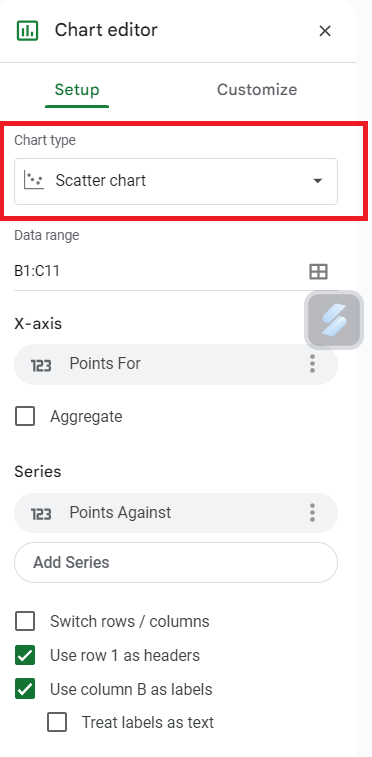
- Click on the “chart type” followed by “scatter chart” from the chart editor options to create a scatter plot.
Customizing a Scatter Plot
If you feel that the default scatter plot created by Google Sheets isn’t providing proper context to the reader about the relationship between two variables, yes, you’re right.
This is why we must customize the graph to establish clarity and help in easy understanding. Here’s how you can do it:
As you open the Chart editor tab, you’ll see two sub-tabs in it: Setup and Customize. Make sure the data range is correct as per your data in the Setup tab.
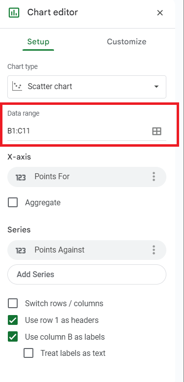
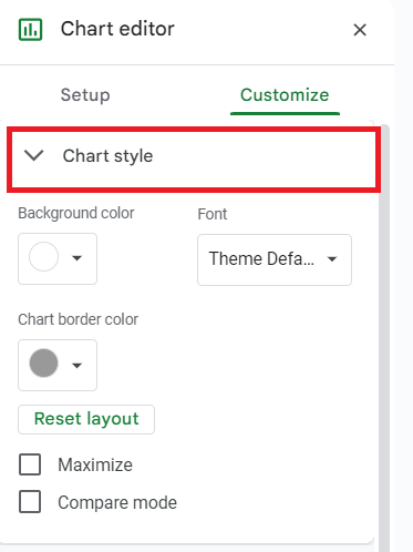
Next, head over to the “Customize” sub-tab. You’ll see several headings, including Chart style, chart & axis titles, series, and legend, alongside the horizontal and vertical axes. We can work with each other to establish clarity, but make sure not to overdo it.
Let’s start with Chart style. Here, you can adjust the background color, font, and chart border color.
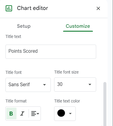
You can also change the axis titles by moving on to the next option, “Chart and axis titles.” Click on the axis to edit and rename it as needed in the “Title Text” box. You can also change the title font, size, format, and color from other available settings.
You can also change the title of individual axes from the “Series” tab position of the legend box from the “Legend” tab while formatting the color, style, and size of values on the horizontal and vertical axis from the remaining tabs.
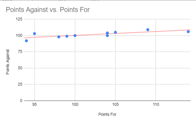
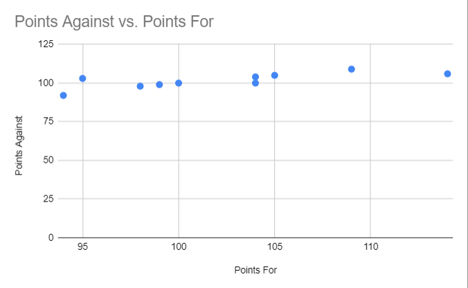
Here’s what the finished graph looks like:
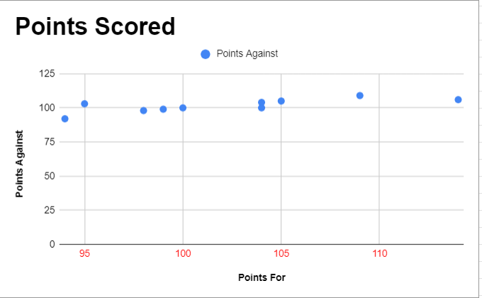
To add more clarity to your scatter plot, add a trendline. What it does is reveal the overall direction or trend of the data or points on the graph.
Here’s how to do it:
- Move on to the Series sub-tab in the Customize tab, where you edited the formatting of individual axes, and scroll down to locate the Trendline tab.
- Click on it to create one. You can further change the line color, type, and label of the trendline.
Here’s what the completed graph looks like. It’s now clearer and easier to understand than it was before formatting.
Frequently Asked Questions
To make a scatter plot with two sets of data, follow the step-wise process:
1. Select the datasets you want to plot
2. Insert a scatter chart by clicking on Insert>Chart.
3. Customize the created chart from settings and add trendlines.
You can make an XY graph in Google Sheets by following the steps to prepare a scatter plot or follow the step-wise process:
1. Open Google Sheets.
2. Click the “Extensions” tab from the main menu, followed by “Charts, Graphs & Visualizations by ChartExpo” > Open. Make sure to install the extension by clicking on Extensions> Get Add-ons> Search for the extension and Install by following the prompts on the screen.
3. Then, click on “add new chart” from the charts library and find “Scatter plot” from the charts list.
4. Select the data and create your chart.
5. Move on to customize and save it.
Wrap Up!
Following the steps mentioned in the tutorial, you can prepare properly formatted and clear scatter plot graphs on Google Sheets in no time.
However, it’s important to keep in mind that scatter plots don’t work with all datasets. If a straight trendline is formed, it means the data doesn’t follow a trend. I hope you find this tutorial useful.
Will see you in another such guide. Till then, take care and good luck.
Leave a Reply