One of the most interesting use cases of Google Slides is to make posters, for both real-life displays and social media. It is the oldest method of marketing. There are so many defaults as well as third-party themes available.
Moreover, considering the rising demand for social media, mobile-friendly aspect ratios like 16:9 can be used in posters, banners, or flyers. Hence, Google Slides can do a lot more than looped presentations. It is your one-stop destination for anything you want to publish.
In this article, I will walk you through the steps to making a poster on Google Slides. I will also take a look at the standard checklist and procedure to make a very good poster. Let us get into it then.
Part 1: Choose a Template & Layout
First things first, you must decide the size of your poster. Normally, a poster is 24 x 36 inches. Digitally, this layout should be fine for you but if you want a printable poster larger than this then you can always choose your custom size.
Here is how you can choose the size of your poster:
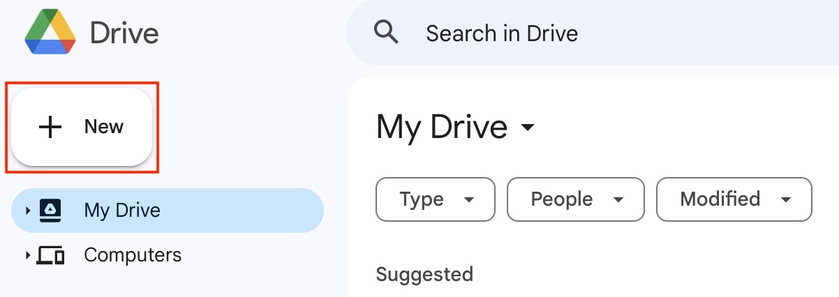
- Open a new Google Slides file by going to “New” from the home screen of your Drive and selecting “New”.
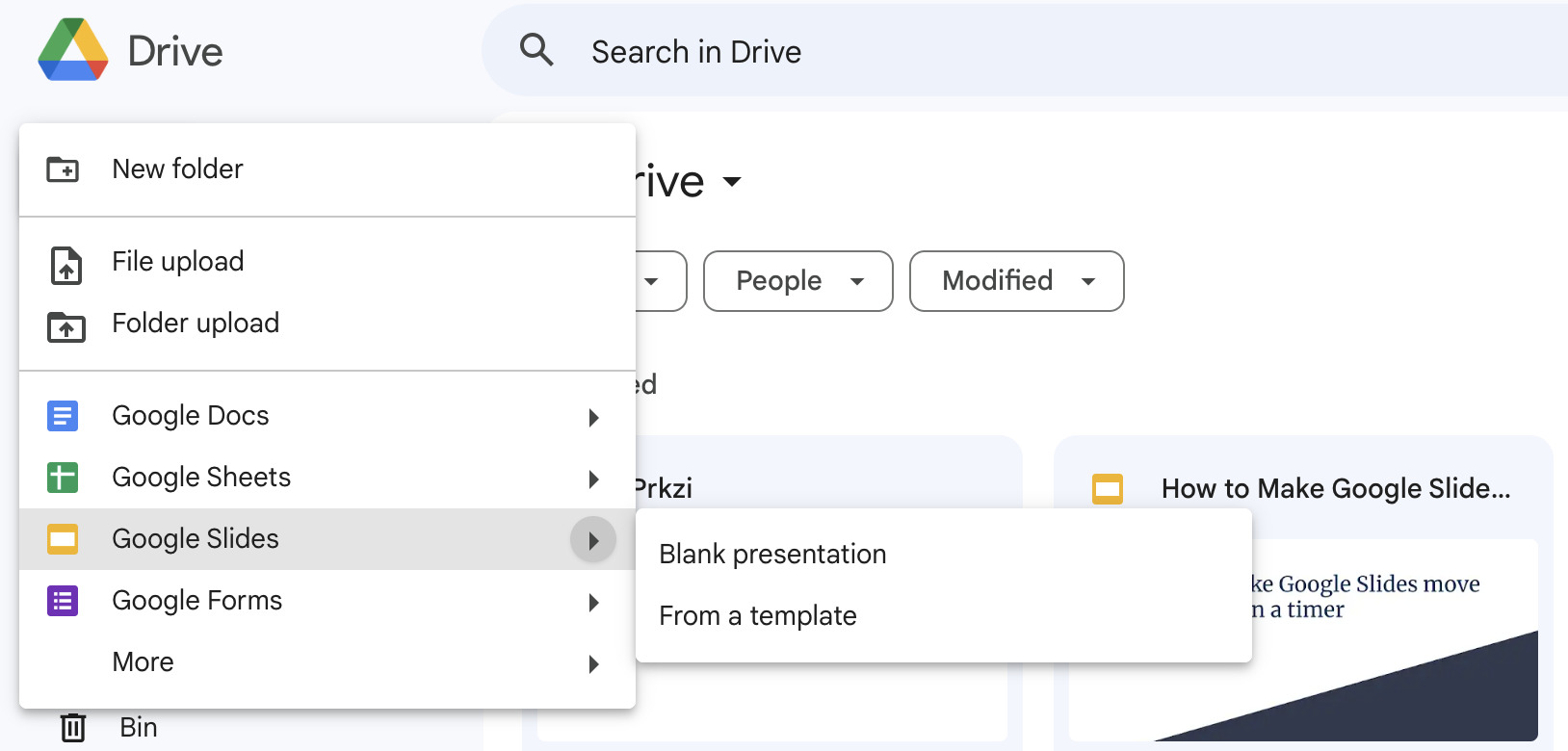
- From the dropdown, go to “Google Slide” and select the arrow to open a sub-dropdown and then select “From a template”.
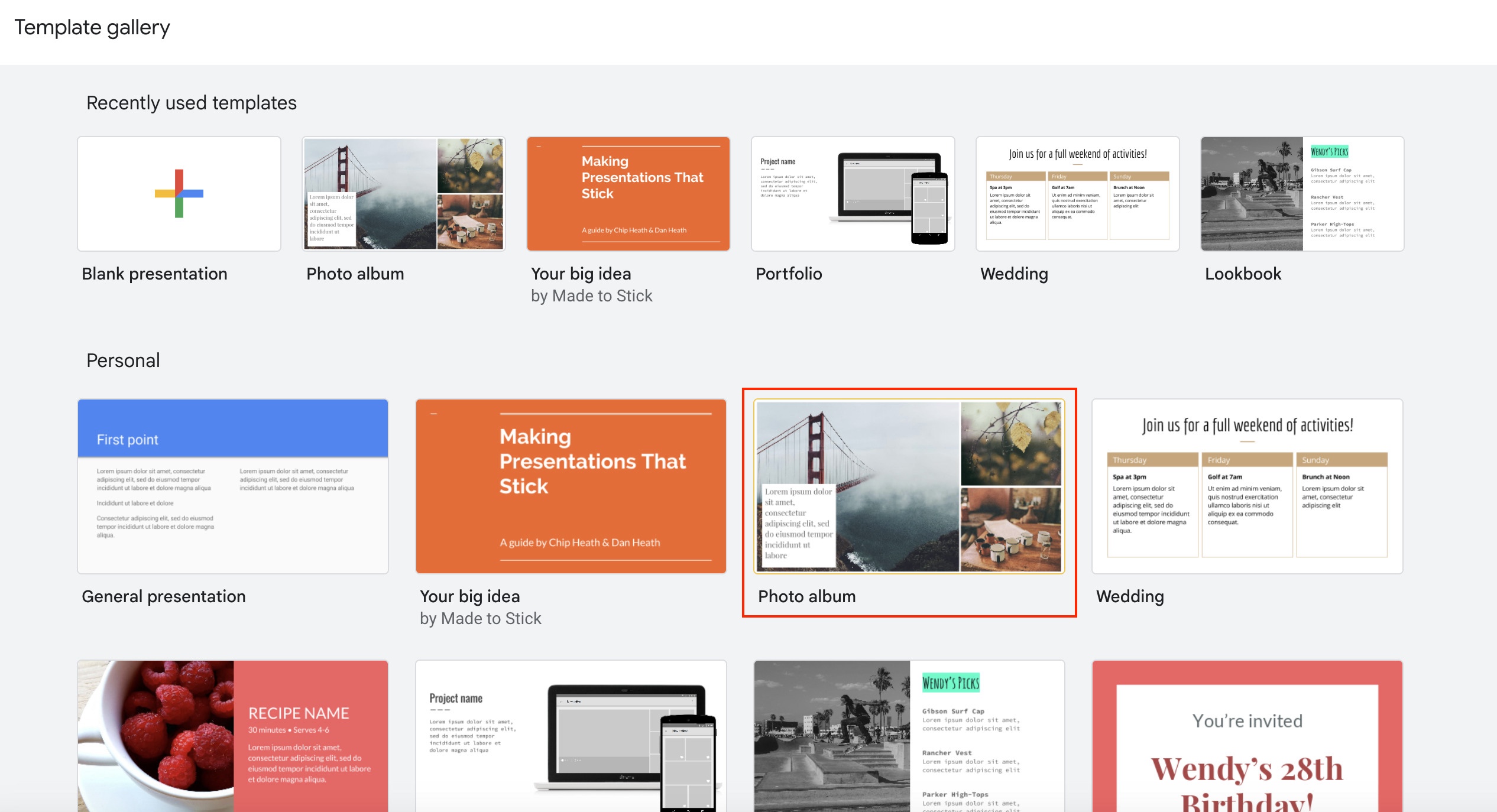
- Select the template you like from the page full of templates. There are many different categories offered at the moment as in-built options.
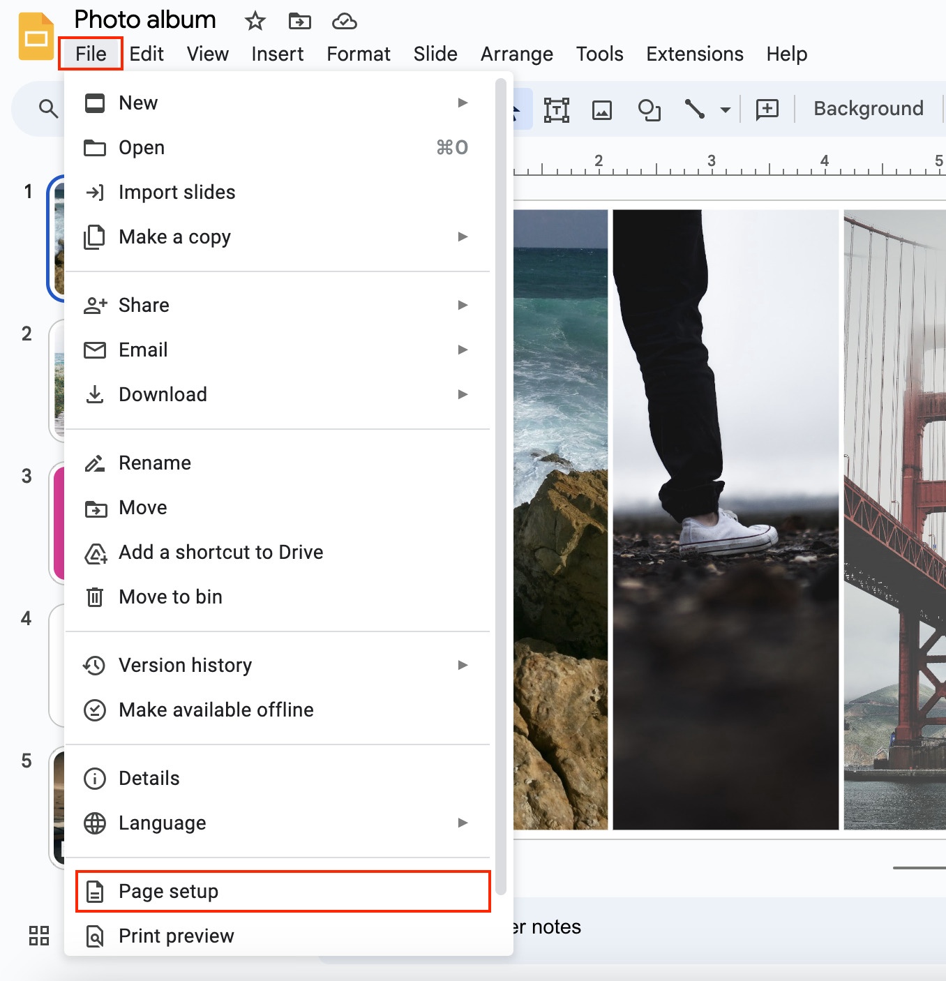
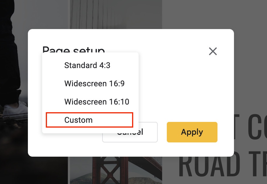
- Upon selecting a new file with the design template, go to “File” from the main menu and select “Page setup”.
- From the dropdown in the size bar, select “Custom”.
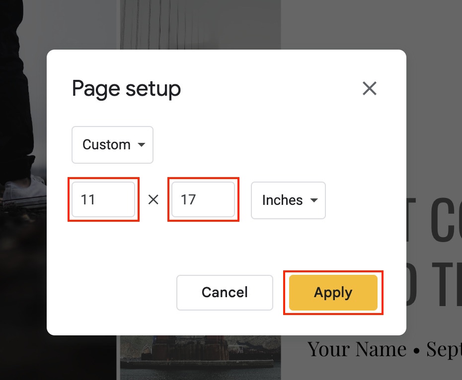
- Add your custom dimensions and hit “Apply” to apply changes.
- If you have opened a blank slide, you can always add a background or apply a theme to it.
You’ve successfully set up a template and layout. Move on to the next step.
Part 2: Add Poster Elements
The poster design is the most important and creative aspect is the design itself. It is quite subjective as each of you would want to make design changes based on how you want the poster to look but the features at your disposal on Google Slides remain the same.
Here are a couple of things to consider while designing a poster in Google Slides:
Alignment
- You only have a limited space to make the most of it so make sure you make the most of every inch.
- Always remember to align your text from each side.
- Define the title of your poster, headings, and subheadings. Apply the most creativity in defining titles, such as rotating the text.
- Use spacing options to make sure the whole content remains at the crunch of the poster even if it goes through different screens or printing.
Content
- Try to add images and charts. Graphics attract more eyeballs than text. Add charts and background images to make your poster look appealing.
- Go to the “Slide” option from the main menu and select “Change background” to edit the background.
- Go to the “Insert” option from the main menu and select from options like Image, Text, Video, Shapes, Graph, Chart, Table, etc., to add graphically rich design elements.
Graphics
- Try different Google Slides transitions.
- Go to “Slides” from the main menu and select “Transition” to add different types of transitions between consecutive slides.
- If you have an image in your poster, then right-click on it and select “Animate” to add animation to your images.
- Similarly, you can also apply animation to text and charts as well.
- Use creative transitions and animations to make the poster appealing.
Part 3: Collaborate and Export
Google Slides allows other editors to collaborate on the design from a remote location. This is great for the modern-day world where people from all around the world work virtually on the same project.
It also allows you to export your project in multiple different formats for you to leverage each platform.
Here are a few things you should consider:
Collaborate
- Share the file from the “Share” option on the top right of the screen.
- Enter the details of the person you want to share it within the first bar.
- Select the type of rights you want to share with them i.e. viewer, commenter or editor.
- Copy the link in case you want to share the file through a different medium.
- Click on “Done” which will then send an email to the person you shared the file with.
- Alternatively, you can also share the link of the file you just copied via text.
- All the different users will have different cursors marked with different colors when you are co-creating.
Export
- You can download the file locally by going to “File” from the main menu and selecting the arrow next to “Download” from the dropdown.
- Select the type of format you want your file to be i.e. PDF, JPG, PNG or SVG.
- Select PDF format to make the file print-friendly.
Things To Consider
Try to follow all the basics just like how we used to follow back in the days to make actual posters. The first thing is to decide on the size we want. Whether it is for printing or a social media poster, we must define the page layout first.
The second thing is the design, where we get a lot of tools and formatting options on Google Slides. If you take care of alignment, content, and graphics as mentioned above, you will most probably create a very good poster.
To add to it, you must keep your export options open, which means you must have multiple formats of local copies of your poster. Lastly, allow others to view, comment, and edit your poster to add objectivity to your work.
Frequently Asked Questions
Firstly, define the size of your poster to 27 x 40 inches, which is the standard size for movie posters.
Go to File > Page setup > Select the dropdown in the bar and go to “Custom” to change the size of the poster. From then on, use your creativity to add images, titles, and subtitles that suit a movie poster.
Academic posters are 35 x 43 inches in size. Use standard text fonts, styles, and colors. Most importantly, use images and graphs/charts to add depth to your poster. Lastly, double-check all the facts and figures.
Google Slide has many default templates that suit different styles like personal, work or based project management. You can choose from the one you like or import one if you have any. What is more important is the dimension which should ideally be 24 x 36 inches.
A poster should ideally be of a 24 x 36 inches size. You can multiply each side to make the design bigger i.e. the poster can also be 48 x 72 or even 72 x 108 inches.
Wrap Up!
Google Slides is a great publishing tool. Creating posters on it is a lot of fun. The tools are minimalistic and pretty straightforward to use. But what makes it very special is its versatility, which allows you to share the file in multiple formats, and its ability to allow remote collaborations.

Leave a Reply