Google Sheets’ line graphs are a great tool for analyzing and presenting trends and patterns. Most working professionals and business people (including me) use them to track the progress or demand over time.
Whether you run a small business, manage an inventory, or are a data analyst, you’ll learn how to create, format, or customize a line chart.
Steps to Make a Line Graph in Google Sheets
Line charts are visually appealing and effectively communicate data-driven insights. They’re perfect for visualizing fluctuations, comparisons, or progress based on various data sets. Here’s how they’re made:
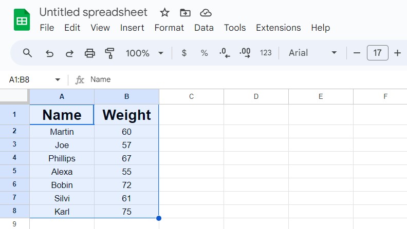
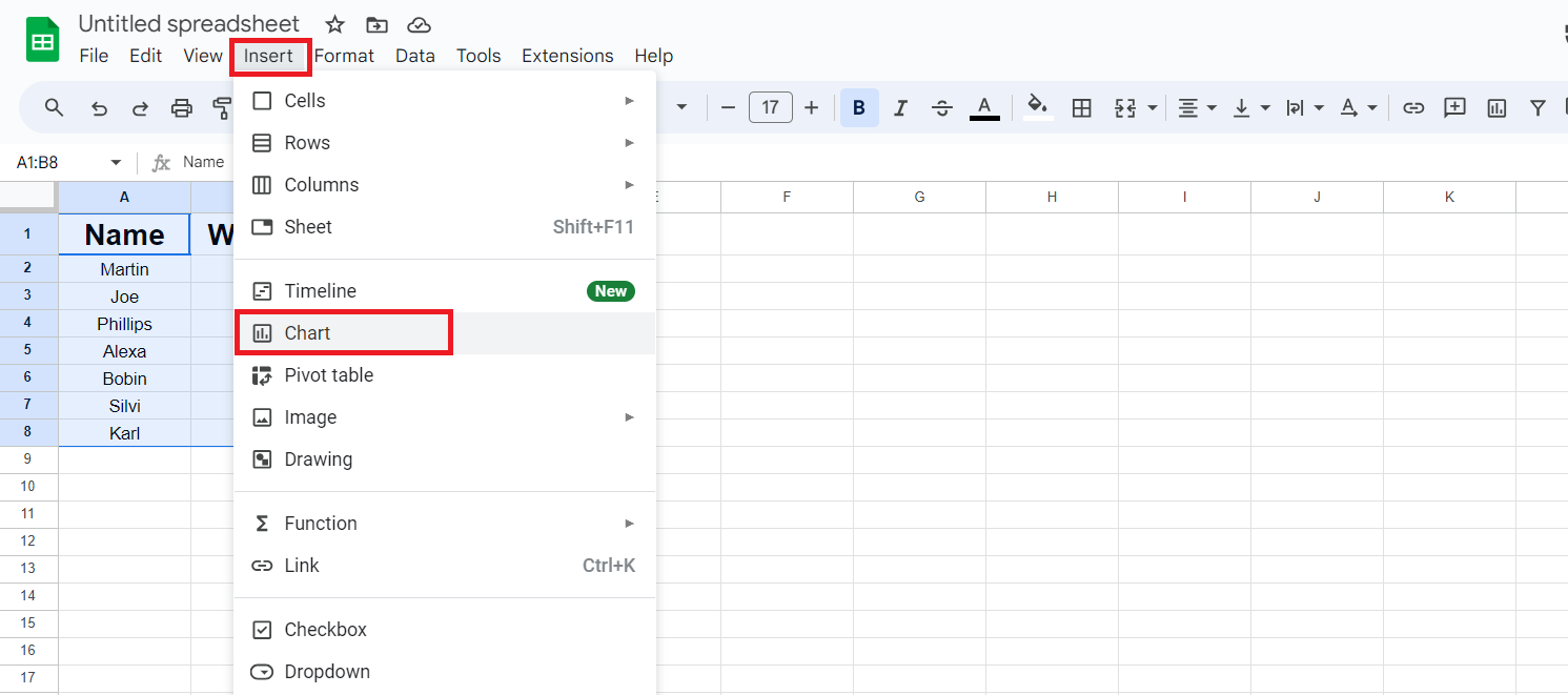
- Open your Sheet and select the data for which you want to prepare a chart.
- Tap the “Insert” menu in the top menu bar, then select “Chart”.
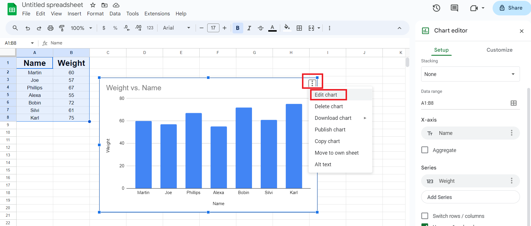
- Left-click on the type of chart created, and click the ellipsis (three dots) in the top right corner.
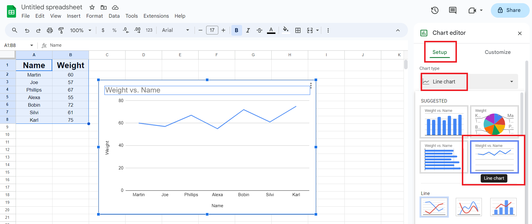
- From the drop-down menu, select “Edit chart”. Now select Line chart from Chart type. It should look like this:
Steps to Customize a Line Chart
Now that you’re done making a line graph, it’s time to customize it to make it more appealing and easy to understand. For instance, you can change colors, text style and size, make a scatter plot, and much more.
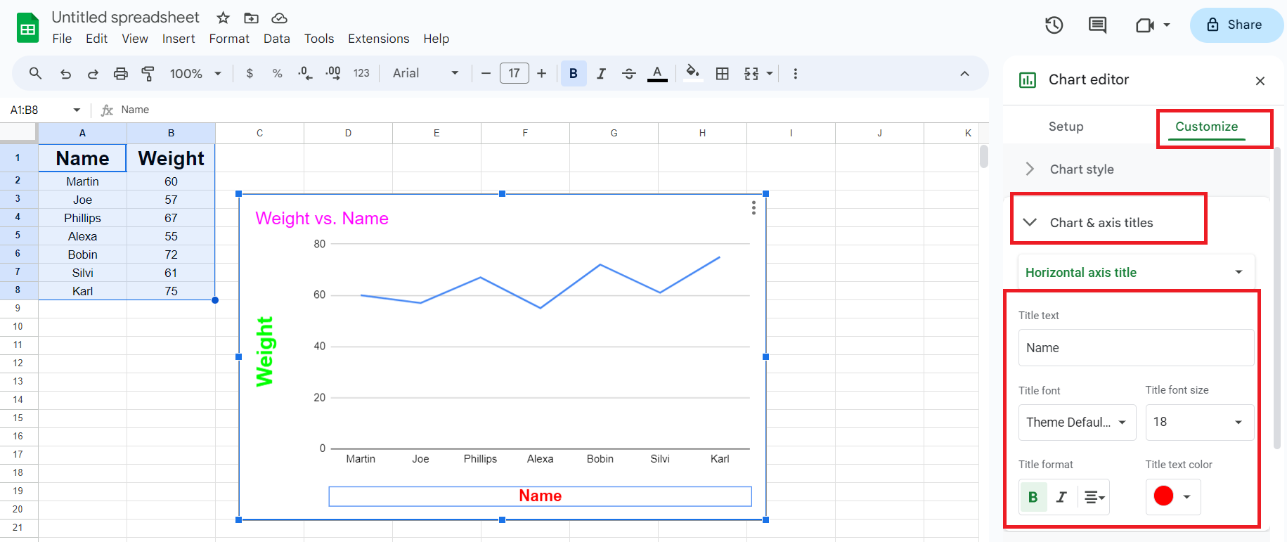
To edit your line chart, the first step is always to click the Customize tab on the right corner and proceed with different options. I’ve explained a few important ones with their applications and effects.
1. Chart and Axis Titles
You can give a title and customize its font, format, font size, and color. To do so,
- Tap Chart and axis titles.
- Under this tab, enter the title, title font, size, format, and text color.
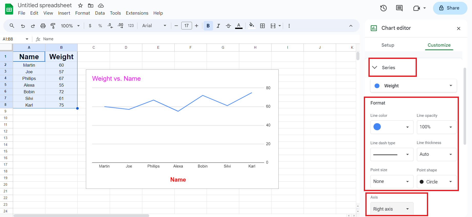
2. Series
You can customize the line color, opacity, type, and thickness of it. You can also change the point size and shape of the chart. Here’s how:
- Navigate to “Series”, and change the aspects you need to customize, like axis position (left or right).
- You can also add error bars, data labels, and trendlines in the Series menu and customize these characteristics.
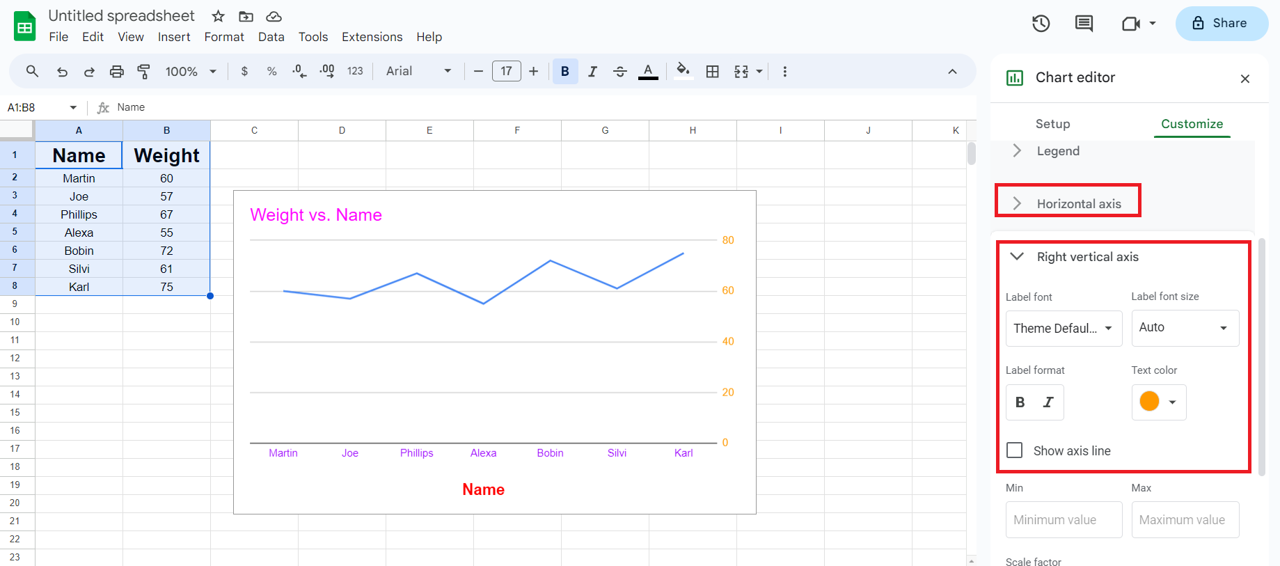
3. Horizontal or Vertical Axis
The axes represent the categories and values of the data in your spreadsheet.
- Navigate to the Horizontal or vertical axis to open a drop-down menu.
- You can also customize font, size, format, and color.
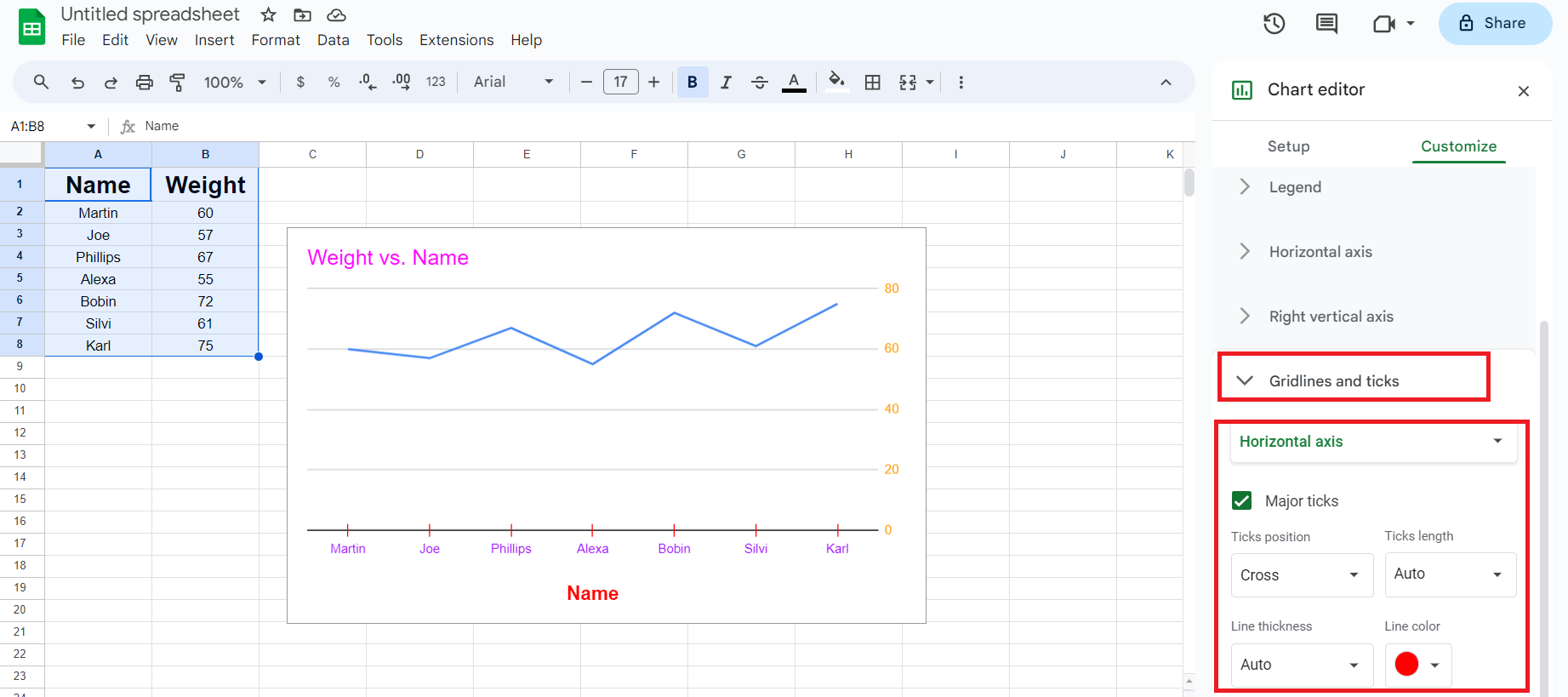
4. Gridlines and Ticks
You can create gridlines and ticks to highlight data on your line chart.
- Navigate to gridlines and tick to open a drop-down menu.
- You can also customize gridline color, tick positions, length, color, and thickness.
Just so you know, Google Sheets has several other tools to visualize your growth & productivity. You can make tables, graphs, bullets, and pie charts.
Types of Line Charts
There are different types of line graphs in Google Sheets. You can represent various data ranges using them. I shall touch upon each and let you know how you can use them to represent different data sets.
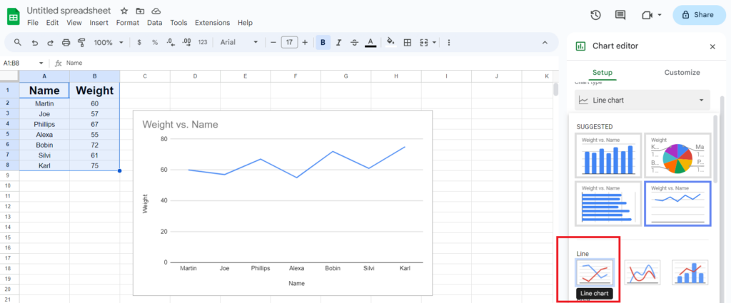
1. Line Chart
You can use a line chart for a seamless representation of data progression with straight lines. Professionals use line charts to monitor sales performances, track stock prices, analyze temperature changes, and more.
A line chart highlights patterns and fluctuations for a continuous data series.
2. Smooth Line Chart
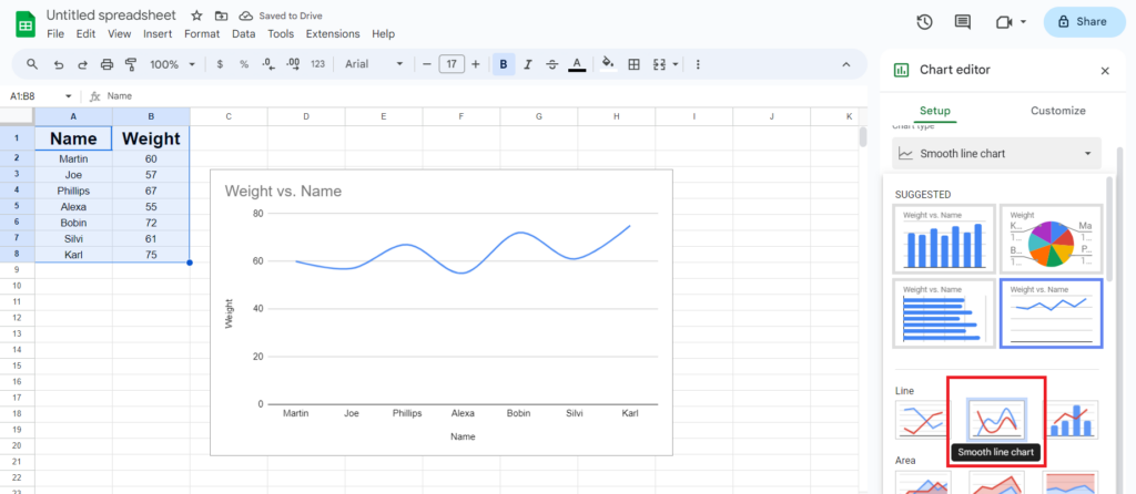
A smooth line chart resembles a line graph. However, a smooth line chart uses curved lines instead of straight lines. You can use these charts for comparative analysis between various data series.
Smooth line charts enhance clarity and are widely used in finance, research, sales analytics, and marketing.
3. Combo Chart
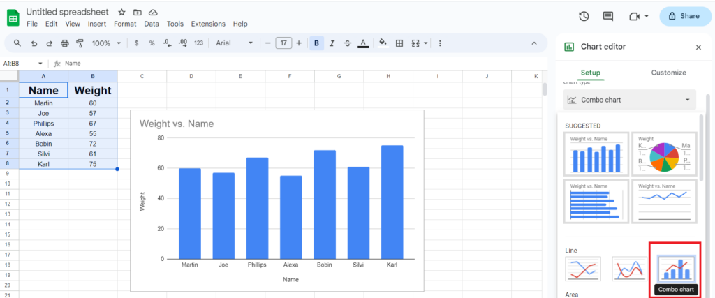
Combo charts enable the visualization of multiple charts into a single graph. They represent data with different characteristics. You can employ combo charts to interpret complex data from diverse data sources. Combo charts enable effective comparison and data analysis.
Frequently Asked Questions
Step 1: Create a line chart as usual by clicking Edit chart.
Step 2: Select the Line chart from the Menu.
Step 3: Under the menu, navigate to Add Series and add the column range.
Step 4: Click OK.
Step 1: Create a line chart as usual.
Step 2: Go to Edit Chart and select Scatter chart.
Step 3: Click the Customize menu on the right.
Step 4: Navigate to Chart and axis title.
Step 5: From the submenu, choose the axis you want to name and enter the desired title.
Step 1: Select the Line chart from the edit chart menu.
Step 2: In the Setup menu, navigate to Add series.
Step 3: Select the range for each data set you want to add, one at a time.
Step 4: Click OK.
Step 1: In the Customize menu, go to Series.
Step 2: Open the Line dash type submenu.
Step 3: Select the type of dash you want in your chart.
Wrap Up!
If you’re struggling to track your productivity and targets or boost motivation, line charts will create compelling visual stories to make data more accessible. It enables creativity to efficiently visualize and analyze data.
These charts can significantly enhance the visual appeal of your presentation while also helping you to track and monitor overtime changes and compare multiple data sets.
Whenever in the future, you want to liven up your presentation, communicate large data sets with line charts, and see how it transforms a lifeless meeting into a forum for exchanging ideas.
Leave a Reply