Graphs are a great way to visualize and interpret data. With just a few clicks, you can turn your spreadsheet data into informative appealing charts. As someone who uses Google Sheets regularly, I find this feature very helpful and have learned to use it at its full potential.
You can make several types of graphs as per your datasets and needs. For instance, you can make a pie chart, a line graph, a bar graph, a scatter plot, etc. In this article, I’ll walk you through a complete process.
So, let us begin!
Making a Graph in Google Sheets
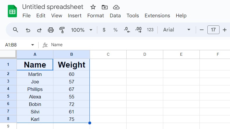
The first step will always be entering the data correctly. Double-check the data and number for any errors.
Now it is time to give a new look to these data and numbers. All you have to do is put the data in these cells into a chart. Follow the below simple steps:
- Carefully select all the cells where you have put your data in. Make sure you are not missing any cells.
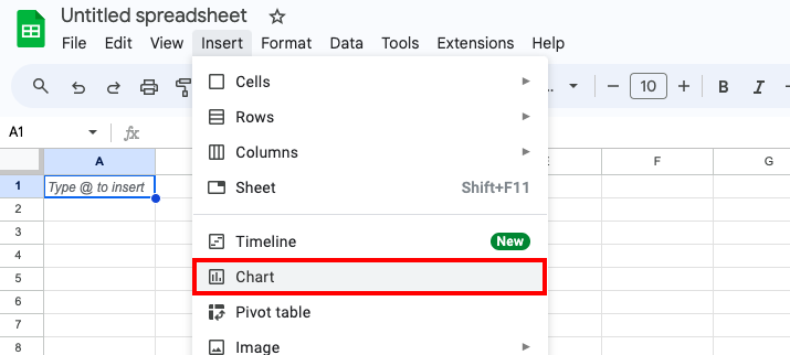
- From the main/ribbon menu right on top, click on the “Insert” tab.
- Select “Chart” from the list of options from the dropdown that appears upon clicking on the “Insert” tab.
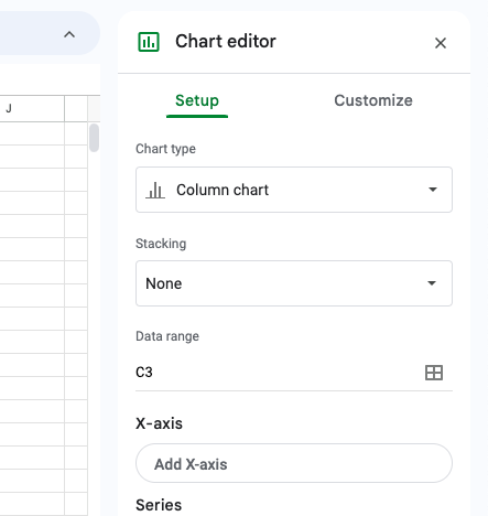
- When you insert a chart, an editor opens on the right panel of the screen. Select further Setup options like the type of chart and other customization options like color, labels, etc.
Tip: If you have sensitive data that you don’t want to be accessed easily, I would suggest applying password protection to your Google Sheets.
Customizing a Graph in Google Sheets
There are many customization options available. Let’s briefly understand each:
- Data Range: This allows you to change the range of data i.e. set of cells you want to include in your chart.
- Appearance: This allows you to change things like fonts, sizes of the fonts, colors, shapes, opacity background, etc.
- Gridlines: You can add gridlines to your chart.
- Individual Points: You can change individual data points and their bars, columns, and lines and make different combinations of charts within the same chart.
- Titles: You can change the titles and subtitles of the X and Y axis of the chart.
- Move & Resize: You can move, resize, or delete certain data points or the entire chart.
- Error Bars: If you want to visualize data variation, adding error bars to Google Sheets can be helpful.
Types of Charts in Google Sheets
| Chart Type | Best Use Case |
|---|---|
| Line | When you need data trends, directional and periodic trajectory |
| Combo | When you want to represent each data series with different data type |
| Area | When you have to track one or more data series |
| Column | When you have multiple categories and sub-categories |
| Bar | When you have to notify difference between data points |
| Pie | When you want to mark contributions and proportions |
| Scatter | When you want to look for trends and patterns without connecting two data points |
| Histogram | When you want to show distribution of data points across the data |
| Candle Stick | When you want to further dissect opening and closing values of a data point |
| Organizational | When you want to display relationships and hierarchy between individuals and designations |
| Tree Map | When you want to portray parent-child hierarchy of data points |
| Geo | When you want to display data based on geography and region |
| Waterfall | When you want to show how latest values add or take away from the initial values |
| Radar | When you want to individually show one or more data points in two-dimensional manner |
| Gauges | When you want to highlight data points within a certain range which presents measurements |
| Annotated Timeline | When you want to highlight timeline of particular data points |
| Table | When you want to simply present data in a neat table manner. |
Frequently Asked Questions
To create it, select your data, then Insert > Chart and “Scatter” in the chart type, and then in the customization panel, select the labels for the X-axis and Y-axis. Upon selecting “Insert” at the end, you will get an XY graph.
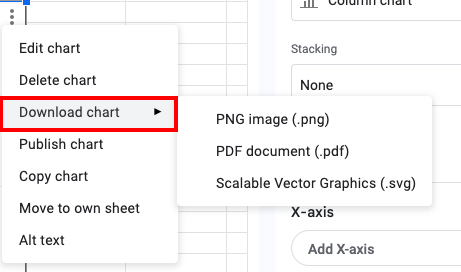
Yes, you can download your graph as a PNG image, a PDF file, or even an SVG file. Select the graph from the sheet, right-click on it, and select the type of file you want to download your graph.
From the “Customize” tab, select “Series” from the dropdown. Enable the “Trendline” option by ticking the box, and it will add a trendline to your data points. You can refer to the complete guide for more detailed instructions.
Wrap Up!
Adding a chart to Google Sheets is fairly straightforward. It is a lot simpler than it may seem. But the real detailing is in the customization.
Choosing the type of chart that suits your data points and selecting between the plethora of different appearance and structural options that Google Sheets offers changes the whole outlook.


Leave a Reply