Numbers, by their inherent nature, are boring. What makes them even worse is if you put them next to each other in the slides. Do you want to visualize them for easy readability and understanding? Make pie charts. But how?
Well, Google Slides allows you both — to create or import pie charts. Additionally, you can also draw a pie chart with the shapes feature. In this guide, I’ll explain all three in detail with steps and requisite pictures.
So, let’s get going!
1. Using the Insert Menu
- Open the Google Slides file where you want to add a pie chart.
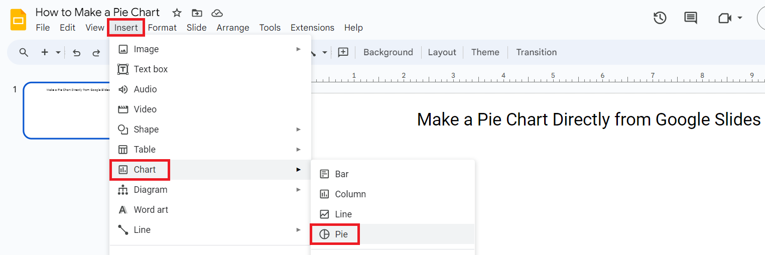
- Click on “Insert” from the main menu.
- Select “Chart” from the dropdown.
- Select “Pie” from the list of shapes that opens in a sub-dropdown.
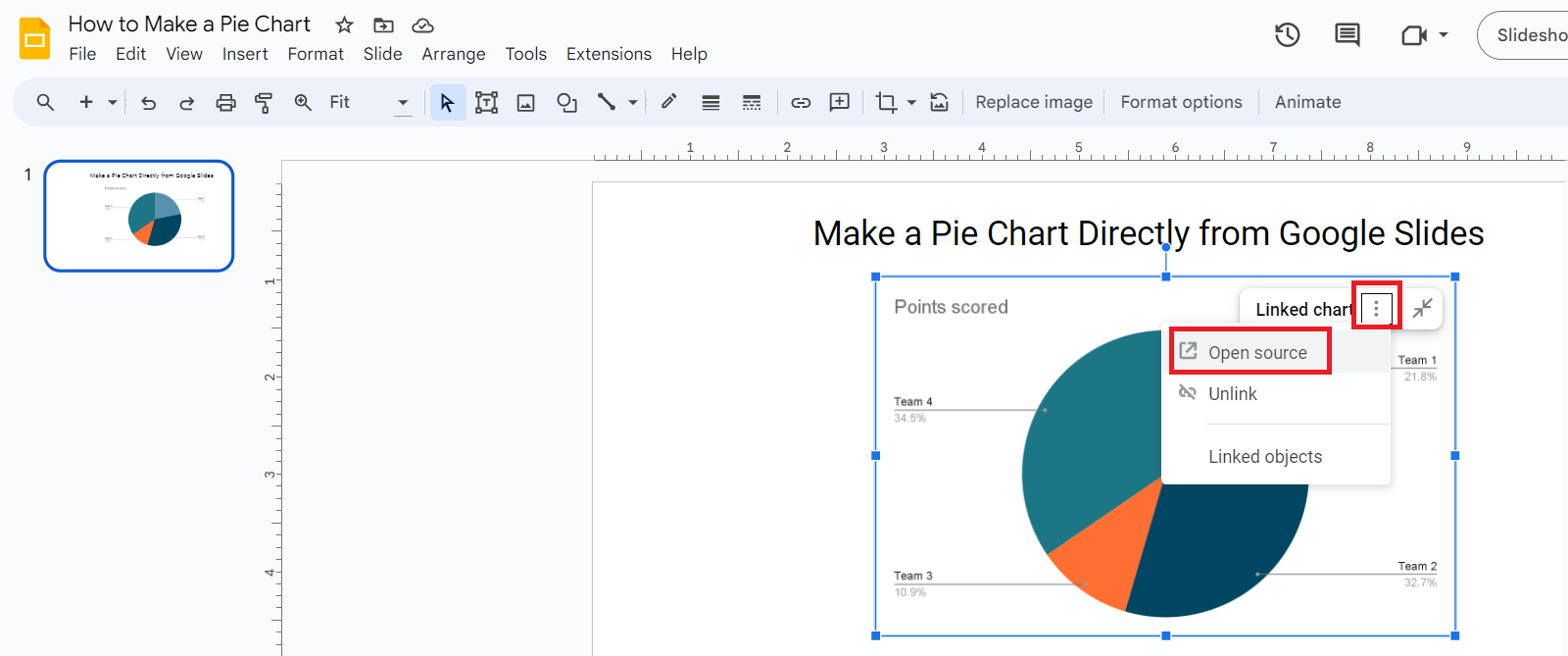
- This will add a chart but in the form of an image. Now click on the ellipsis (three dots) on the top right of the chart.
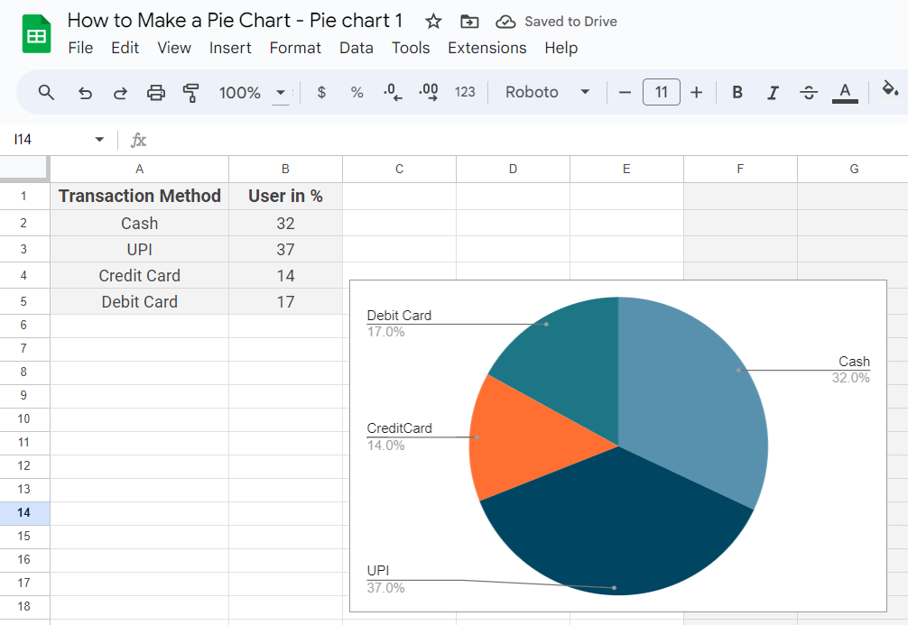
- Select “Open source”. This will open a separate spreadsheet where you can enter all the data you want for the pie chart.
- Enter relevant data including headings and data for other cells.
- Go back to your Google Slides file once you enter all the data.
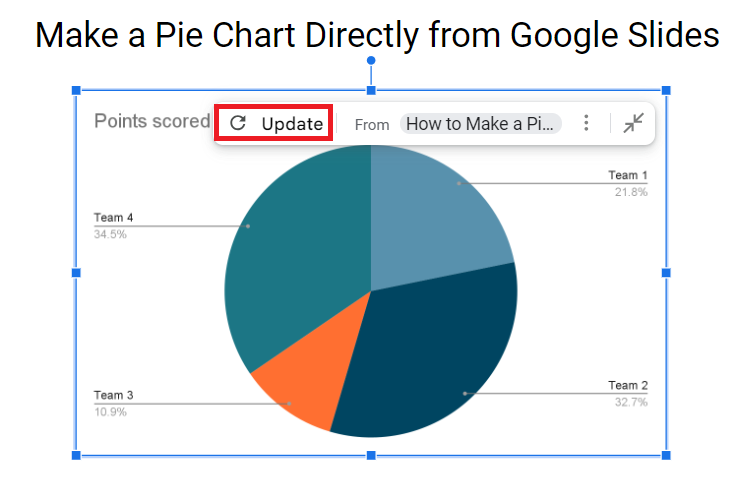
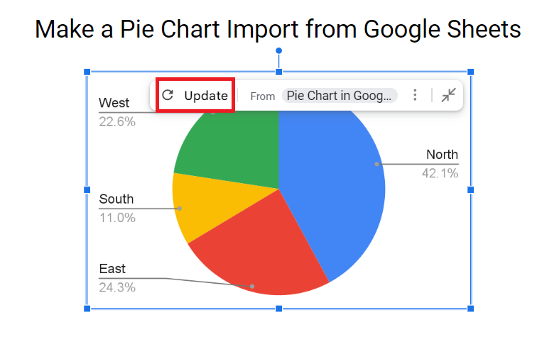
- Now Select “Update” which will appear on the top right of the chart.
- Done. The pie chart will now appear on your slide.
2. Import from Google Sheets
If you already have the data ready in a Google Sheet, you’re better off using this method. First, create a pie chart in Google Sheets and follow the steps below:
- Open the Google Slides file where you want to insert a pie chart.
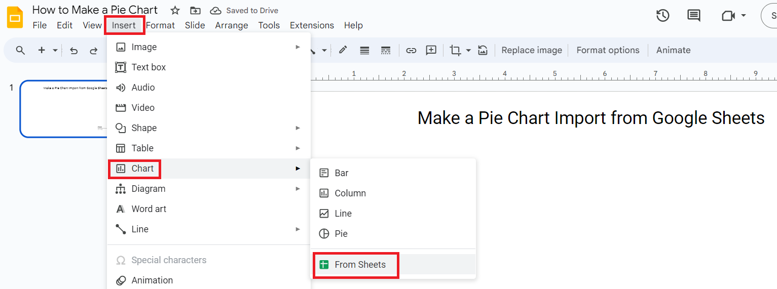
- Click on “Insert” from the main menu.
- Select “Chart” from the dropdown.
- Select “From Sheets” in the sub-dropdown menu.
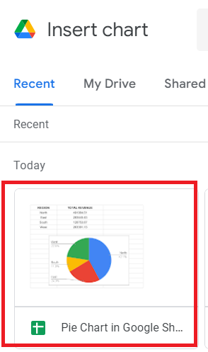
- Now, browse a chart from the Drive window. This window consists of recent files from your Drive you can fetch chart sheets from.
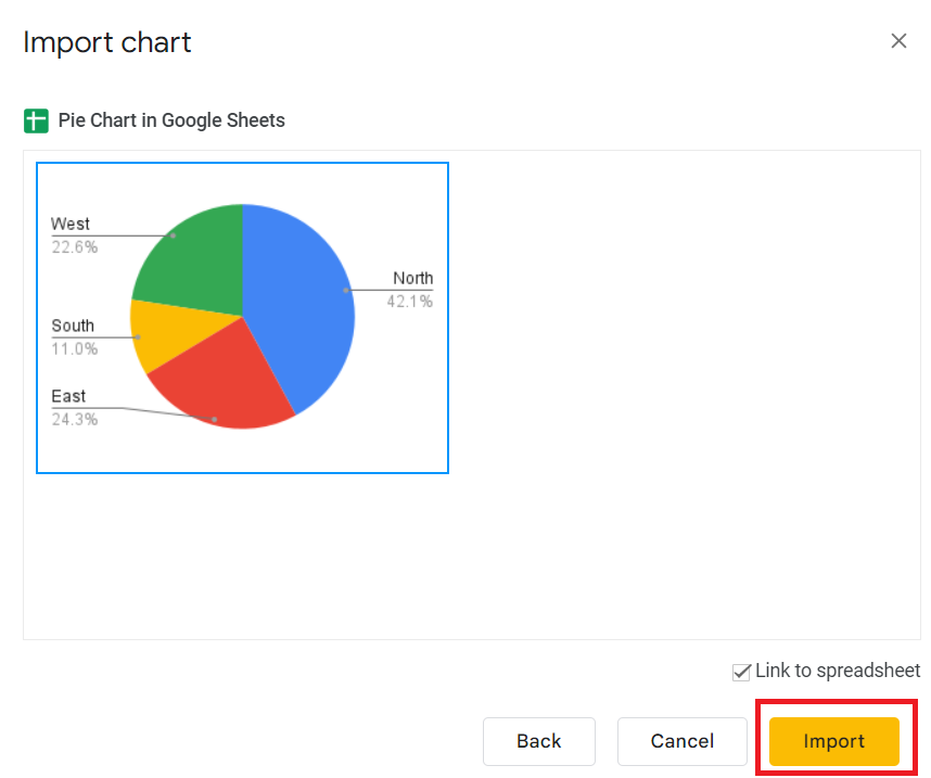
- Click on the “import” button. Make sure Link to spreadsheet is checked.
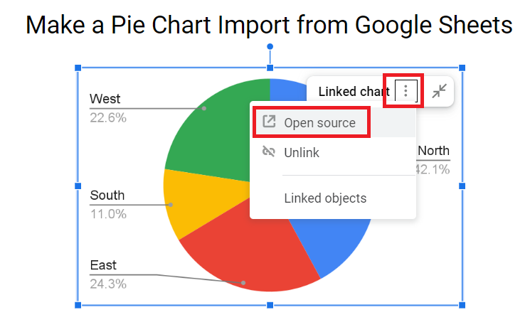
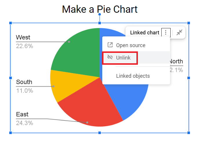
- If you wish to edit the chart data, click on the ellipsis (three dots) on the top right of the chart and select “Open source”. This will open a separate spreadsheet where you can edit the pie chart.
- Edit data including headings and data for other cells.
- Go back to your Google Slides file once you enter all the data.
- Now Select “Update” which will appear on the top right of the chart.
- Done. The changes will appear in Google Slides.
Alternatively, you can also copy and paste a pie chart directly from Google Sheets. Here is how.
- Copy a pie chart from Google Sheets.
- Paste it on the destination slide on your Google Slides file.
- Select whether you want to link it with the original spreadsheet or you want to paste the chart unlinked.
- Edit the chart using the aforementioned process.
3. Using Shapes in Google Slides
In terms of proportions, drawing a pie-shaped chart in Slides directly may not be an ideal option but in case you’re good at designing.
This way you can also animate different pie slices since all of them would be separate design elements.
- Open the Google Slides file where you want to add a pie chart.
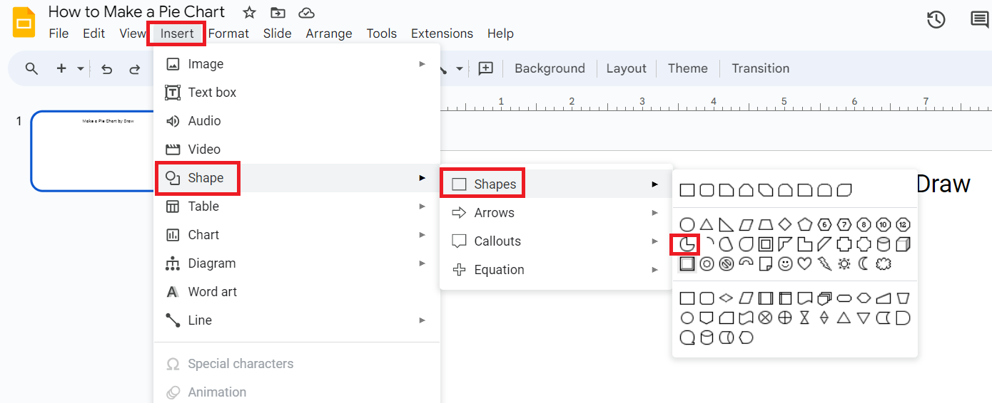
- Click on “Insert” from the main menu.
- Select “Shapes” from the dropdown.
- Select “Shapes” again from the sub-dropdown.
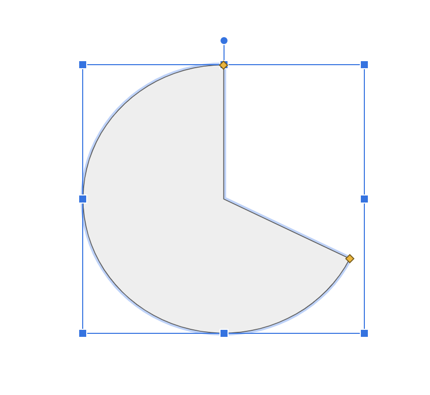
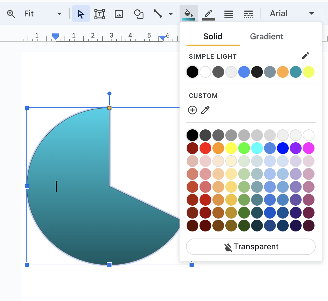
- Locate the pie-type shapes from the list of shapes and select them one by one.
- Align and adjust the shape as per your requirement to form a pie chart.
- Add relevant text and numbers to your pie.
- Change the colors of the pie and format the appearance of the chart.
Best Practices for Google Slides Pie Charts
Here are some useful tips to create engaging pie charts without compromising on important data.
- Merge smaller pie slices: Do not add too many small slices of pie into the chart as it creates a cluttered appearance. Merge small slices into one and define them with text for indication.
- Avoid writing inside the pie design: If you are drawing the chart with shapes, remember to always write relevant text and numbers outside of the design and not inside the design of the pie slices.
- Order: Remember always to maintain an order of pie slices. This includes putting pie slices together based on the size. The smallest slices should be the last and the biggest ones should be adjacent.
- Link: Always link your pie chart from Google Slides to a spreadsheet. This makes it easy for you to update data and subsequently update the pie chart.
Frequently Asked Questions
Yes, you can apply animation to your pie charts in Google Slides. Right-click on the chart and select “Animate”. From the editor menu that appears on the right side of the screen, go to “Object Animations” and select the animation type for the chart.
Select the three dots on the top right of the chart and select “Open source” which will open a spreadsheet. You will see the chart and its source data in the sheet here. Double-click on the title to change. Now go to the Slides file and select “Update chart”.
Yes, you can add or make a graph in Google Slides. Go to the “Insert” tab from the main menu and go to “Chart”. From the sub-dropdown, select the type of graph you want to add i.e. bar, column, or line. Alternatively, you can also import a graph from your Google Sheets file or draw graphs using different drawing tools on Google Slides.
Simply copy the pie chart from the Google Sheets file and paste it to the destination Google Slides file. You can also do it by going to “Insert” from the main menu and selecting “Chart” and then the “From Sheets” option from the sub-dropdown.
Wrap Up!
Charts and graphs are visual representations of numbers. We must use a pie chart feature in Google Slides to present data in its best form visually.
Leave a Reply