As someone who uses Google Sheets a lot, I understand how frustrating it can be when you have a ton of data. Even if your spreadsheet is well-organized, long rows of numbers can all blur together.
However, turning that messy data into tables can completely change how you analyze the information. You can create different types of tables in Google Sheets. In this article, I shall explain the following:
Furthermore, I shall also share some ‘Pro’ tips for customizing them. So, without further delay, let’s get started!
Making a Data Table in Google Sheets
These are the most basic tables that are commonly used in schools, colleges, and offices for various purposes. Here’s how to create one:
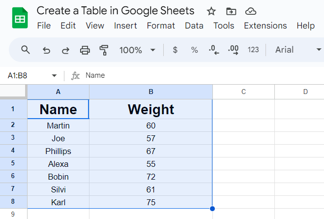
- Add the titles for the vertical columns and horizontal rows.
- Once you have defined the headers, enter all the relevant data in the cells. Make sure each cell is filled with correct data.
- Now, select all the cells that you want to convert into tables.
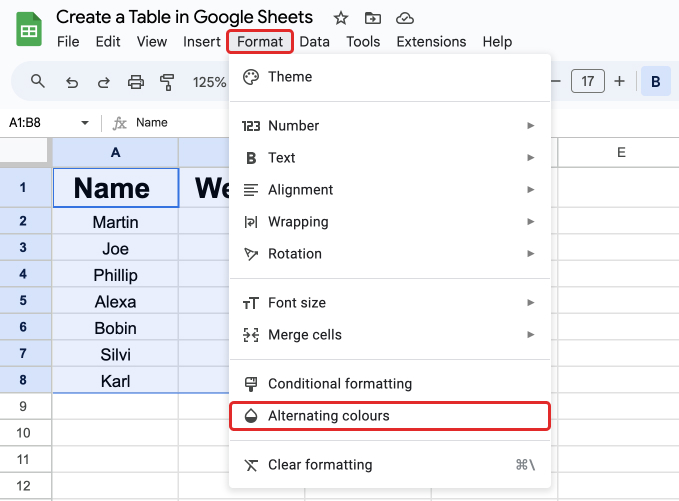
- Then go to the “Format” tab from the main menu and select “Alternating colors” which will open an editor on the right.
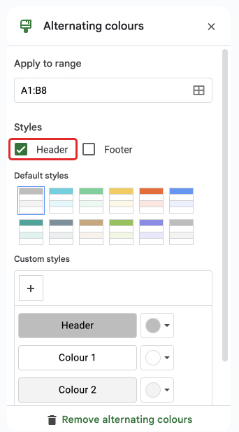
- Next, in the editor on the right side of the screen, check the box that says “Headers”. This will allow Google Sheets to automatically detect headers on your table.
- Below the headers checkbox, you will see a set of colors which you can apply in an alternating manner for headers and other cells.
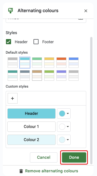
- Upon selecting all the colors, simply select “Done” which will confirm your changes and apply them to the table.
Making a Pivot Table in Google Sheets
Pivot tables were introduced to largely narrow down a large data set and to explore relationships between the data points. Enterprises and organizations benefit from these as they allow for analyzing multiple data sets.
Essentially, a regular table is in two dimensions (mainly two axes). But a pivot table works in three dimensions which helps you get great analytical insights and churn out key performance indexes.
You don’t need to enter a table as the default format of the platform involves entering data in rows and columns. There is a separate option to create a pivot table from the “Insert” tab in the main menu.
Let us go through the complete process:
- Open the spreadsheet that you want to convert into a pivot table.
- Select the range of cells that contain your data.
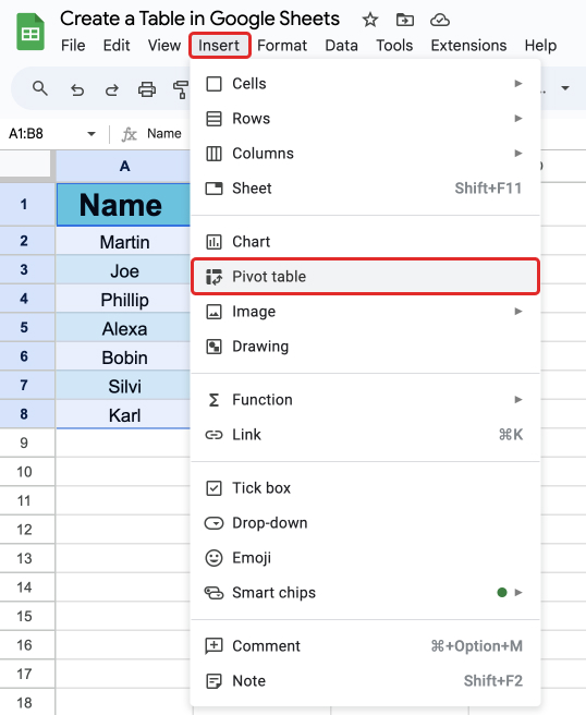
- Go to the “Insert” tab from the main menu.
- Select “Pivot table” from the dropdown.
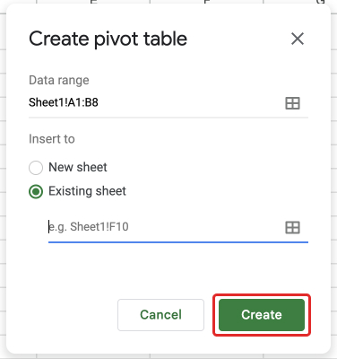
- Select whether you want your pivot table to be in the existing sheet or a new sheet from the pop-up.
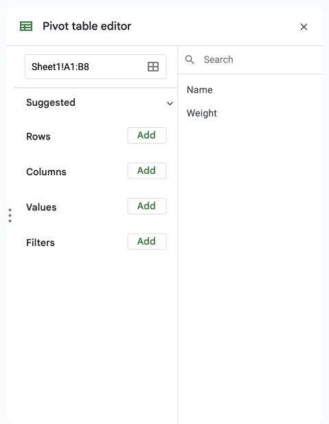
- Select any suggested filter for your data points from the “Suggested” tab in the editor that appears on the right side of your screen.
- Add additional filters for your data points based on the rows, columns, values and filters from your table.
That is it. You have now created a pivot table. Note that you need to fine-tune the filters and the conditions to optimize your pivot table.
More criteria and conditions result in dense analytics which helps you derive key performance indexes and make more informed decisions.
Making a Sortable Table in Google Sheets
Most of the time when you enter data in your Google Sheets file, it is in a linear fashion. Which means you enter the data as it comes to you. But what if you want to sort the data based on a particular criteria?
Forget about the complex conditions and filters, what if you want to sort out a few names in alphabetical order?
Thankfully, Google Sheets allows you to sort both individual columns and an entire table as well. There are essentially three ways to make a table a sortable one based on the type of sorting you want.
Here are all three methods explained in detail.
Method 1: Using Right Click
- Open the Google Sheets file that contains your data table.
- Select the data range of the table.
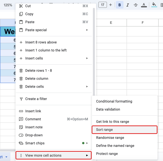
- Right-click on the selection.
- Scroll down and select “More cell actions”.
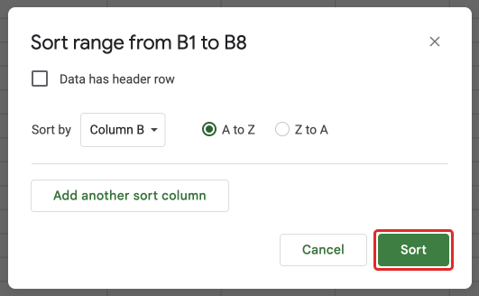
- Select “Sort range”.
- Select the options of sorting based on headings from the pop-up.
Method 2: Using Functions
The SORT and QUERY functions allow you to sort your data inside the table. Here are the syntaxes for both the functions:
Syntax for SORT: =SORT(range, sort_column, is_ascending)
Syntax for QUERY: =QUERY(range, “order by sort_column”)
The range defines the range of cells you want to include in the sorting. The sort_coumun defines the order of the column you want to add as a condition. For the is_ascending value, you have to either enter TRUE or FALSE.
To apply these functions, select the range of cells from the table and click on the “Function” icon from the ribbon bar. Select “All” from the dropdown and locate and select “SORT” or “QUERY” functions from the sub-dropdown.
Alternatively, you can also select the cells from the table and write the function directly into the function bar.
Method 3: Using Filters
You can also add filters to each heading that allow you to sort each column of the table separately. Here is how you can do that.
- Open the Google Sheets file that contains your data table.
- Select the data range of the table.
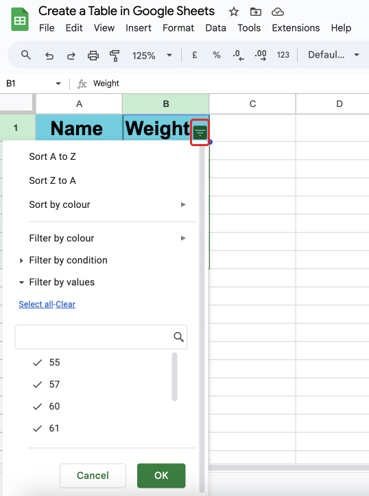
- Click on the “Filter” icon from the ribbon menu.
- Click on each filter icon that appears next to the headings of your columns.
- Select the filtering criteria.
There are some default actions like sums and sorting that help you with basic arrangements on your table. But the true essence of Google Sheets is its ability to provide vast filters and sorting options that give you a great analytical insight into your data.
Making a Frequency Table in Google Sheets
You have heard about sorting your table based on alphabetical or numeric values. You have also heard about filtering your data set based on custom filters. But have you heard about sorting or filtering your data based on how frequently it appears in a particular range?
With a frequency table, you can churn out how frequently your data has appeared from the selected range. The frequency feature helps you quickly note down a particular data set that appears more than others.
Let us take a look at how you can create a frequency table in Google Sheets.
The syntax of the FREQUENCY function includes two ranges. The first range indicates the range from which you want to select the frequency and the second range indicates the grouping.
Syntax of the FREQUENCY function: =FREQUENCY(RANGE1, RANGE2)
Follow the steps below to create a frequency table:
- Open the Google Sheets file that contains your data table.
- Enter relevant data (For example: name, age and age group) in your columns with headings.
- Write the Frequency function =FREQUENCY(RANGE 1, RANGE 2) where range 1 denotes the cells containing age and range 2 denotes cells containing age groups.
Upon pressing enter, you will have a separate list of numbers that denote the number of people belonging to each age group. All you have to do now is to put labels next to (or before) these numbers.
Tips To Customize a Table
By taking a few minutes to create tables, you can save hours of headache squinting through messy sheets. Additionally, there are quite a few customizations that you can do with your Google Sheets tables.
For instance, apart from regular formatting of the table, you can also create custom formulas and add custom filters that help you access your desired data set. Here’s what you can do:
- Add borders and outlines for the structure.
- Center align text.
- Change row/column colors for visual organization.
- Apply custom formulas to sum columns and find averages.
- Create filters for sorting, searching, and analyzing.
- Make groups collapsible for organizing large sheets.
- Adjust column widths, add or delete rows, and columns, change styles, indent data, and more.
- For a better visual representation, add a pie chart.
- For periodic and behavioral change representations, add a trendline.
- For analyzing trends, add a line graph.
There are some prerequisites for customizing tables. Here they are:
- Organize: Make sure the data you enter is well organized. Make rows and columns based on the way you want your data to be set up. Use appropriate headings for columns and rows.
- Filter: Upon entering all the data, select the range and use the “Filter” option from the toolbar to assign headings and separate data from it.
- Sketch: Sketch out what type of analytics you want from your pivot table. Narrow down the criteria and key indexes which you want to conclude from your data.
Wrap Up!
Making tables is easy and they make spreadsheets even easier to navigate by:
- Segmenting data into logical sections.
- Applying quick formats for clarity.
- Organizing with sorting, filtering, and grouping.
- Adding formulas for fast calculations and summaries.
- Enhancing readability with colors and text formatting.
You can easily consider the whole sheet or set of data within the sheet as a table by default. While you won’t be wrong in your consideration, it takes a little more than just entering the data in those cells to format a table.
There are many fine features that allow you to access data sets more effectively once you create tables out of mere cells.
Leave a Reply