Google Sheets’ trendline is a great feature to represent data, especially when it is periodic and behavioral. It helps you create an immersive pattern to understand the data points better. You can also forecast the upcoming period based on the patterns you have.
The trendline can be added to scatter plots, line graphs, etc. However, if you don’t know how to create it, you’re in the right place.
Steps to Add a Trendline in Google Sheets
You have to enter data in the form of a chart to be able to convert the data into trendlines. This might sound advanced, but it is straightforward. All you have to do is go to “Insert” and select “Chart” and then follow the below steps:
- Select the chart that has the data that you want to convert into a trendline. Double-click on the chart to access the editor panel on the right.
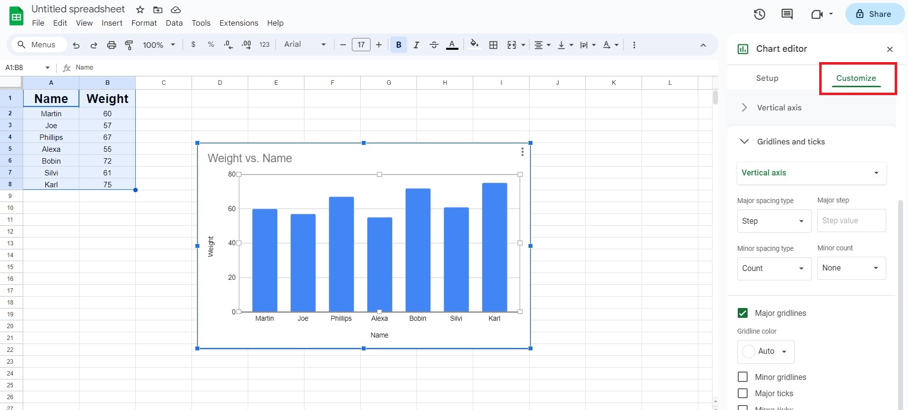
- Upon double-clicking on the chart, you will be able to access an editor panel on the right side of your sheet which will have all the options for the chart. Select the “Customize” tab from the top.
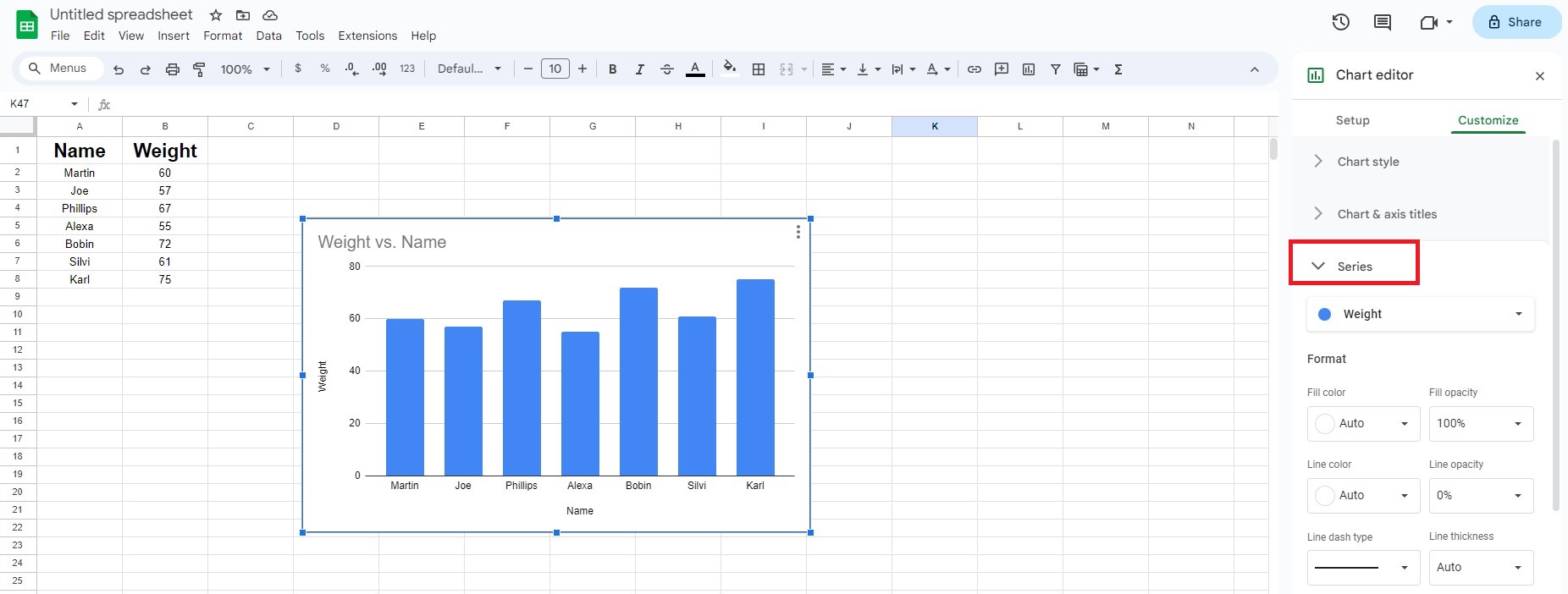
- From the list of customization options, select the “Series” option.
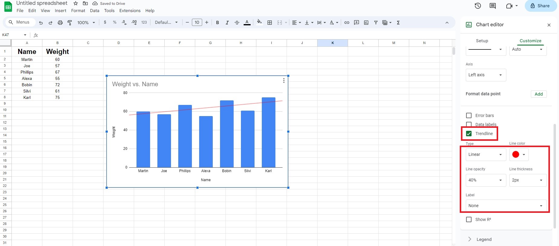
- Upon entering the “Series” option, you will be able to see options with a checkbox preceding their names. Check the box with the name “Trendline” next to it.
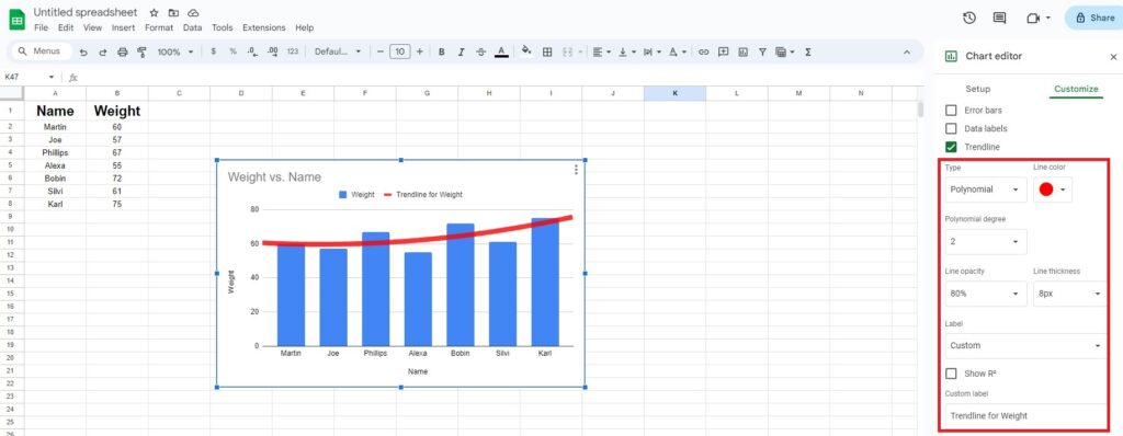
- Right below the checkboxes, you will be able to see other formatting options like type, color, opacity, etc. Choose the type of trendline you want (linear, exponential, moving average, etc).
- You should now be able to see the trendline in your chart. It is now time to close the editor panel. That is it. You have successfully added a trendline.
Note: Besides trendlines, Google Sheets has several features to visualize data. For instance, you can add error bars, create tables, bullet points, and pie charts.
Customizing Trendline in Google Sheets
You can customize the trendline the way you want. The customizations are not just limited to colors and fonts.
Although colors and fonts make the visual data look appealing, it is the structure and pattern of the trendline that give you an accurate overview of the data.

Here are a few things you can customize in a trendline:
- Types: You can choose from different types of trendlines like linear, polynomial, exponential, moving average, etc.
- Color: You can choose the color you want for the trendline.
- Opacity: You can choose the transparency of the trendline by adjusting the opacity.
- Thickness: You can adjust the thickness of the trendline.
- Labels: You can add labels to different data sets.
- Degrees: You can adjust the degrees if you have selected polynomial trendlines.
- Average Types: If you have selected moving average trendlines, you can select the type of averages you want.
- Periods: You can adjust the period (duration) of the moving averages if you have selected the moving average trendlines.
Frequently Asked Questions
Step 1: Create a trendline (obviously!)
Step 2: Now, under trendline option, click on “Label”.
Step 3: Here, select ‘Use equation’.
Voila! You’ve successfully added an equation of trendline.
Google Sheets supports several common types of Trendlines like Linear, Exponential, Logarithmic, Polynomial, and Moving average.
Unfortunately, Google Sheets does not allow adding Trendlines to column or bar charts. Trendlines can only be added to XY scatter plots, bubble charts, and line charts.
You need to select the whole chart first instead of a single data series to add a Trendline to multiple series. Then when you open the Trendline options, you can choose which data series to apply the Trendline to.
Wrap Up!
Trendline graphs help analyze data over time, make predictions based on historical data, and see overall patterns more clearly. In just a few clicks, you can insert and format trendlines to highlight key data insights.
I hope my guide helped you in creating and customizing one in your Google Sheets. Happy documenting!


Leave a Reply