Error bars in Google Sheets represent the extent to which a data point can vary. They are mainly used to show the levels of uncertainty of certain data. But is adding an error bar the same as adding any regular bars in charts?
Well, half of the process is the same. In the sense that you still use the Insert option from the menu bar. The only difference is that Google Sheets has a range of different types of bar representations to match your data type.
In this article, I will explain the steps, types of error bars, their configuration and how to edit them. So let us get into it.
Steps To Add Error Bars in Google Sheets
With charts and bars, you can create a chart where the data points not only depict their actual values but you can also display the variability of the data points compared to a reference value.
Now as iterated earlier, adding the error bars includes some of the common steps that are performed while adding any regular bars for a chart.
Enter relevant data into rows and columns accurately. Make sure you have your headings correct, as they act as axes on the chart. After you are done entering data, perform the below steps:
- Select the data. Select and highlight all columns and rows which you want to convert into.
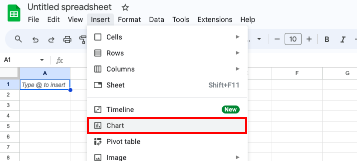
- Go to “Insert” from the main menu and select “Chart” from the dropdown.
- Now, access the editor that opens on the right side of the screen.
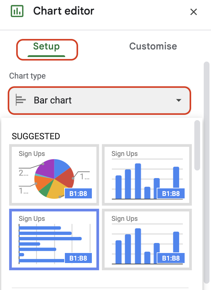
- Click on “Setup”.
- Go to “Chart Type” and select “Bar chart”.
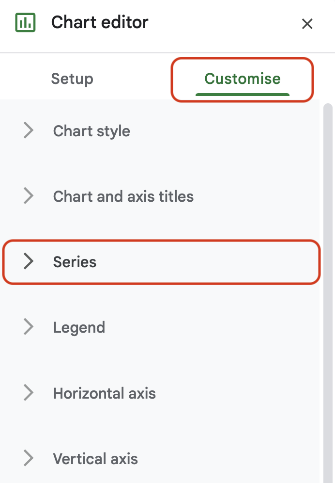
- Now, locate and expand the option “Series” under the “Customize” tab.
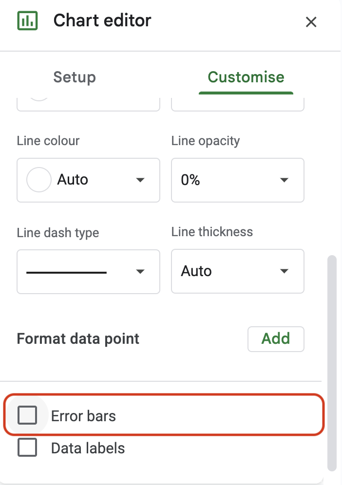
- Locate and click on “Error bars” under the “Series” option.
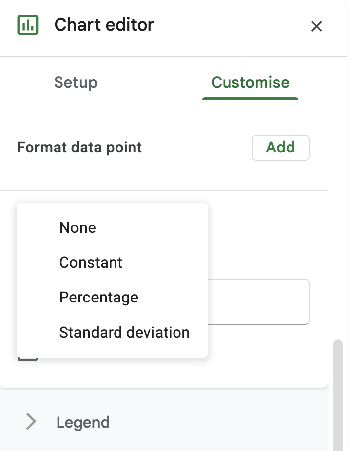
- Select the type of data point you want as a reference for the error bars. The options are None, Constant, Percent, and Standard Deviation.
- Enter the corresponding values based on the type of data point you choose for your error bars. For instance, if you have selected Percentage, then enter the percentage of variability you want to show in the error bar.
Tip: If your data is too sensitive, you can set up a password in Google Sheets.
Viewing & Editing Error Bars
You should now be able to see the error bars on the regular bars. The two ends of the bars are the upper and lower values of the type of data point you selected.
If you are wondering what those three different types of data points mean for error bars, here is a brief explanation of three of them:
- Constant: Use this type of style for an error bar where you want to show variability by a fixed or a constant value. For instance, if you keep the value for a constant type of error bar to 100, then the chart will show error bars with a range of -100 to +100.
- Percentage: Use this type of style for an error bar where you want to show variability by percentage. For instance, if you keep the value for a percentage type of error bar to 10%, then the chart will show error bars with a range of +10% of the data point to -10% of the data point.
- Standard Deviation: Use this type of style for an error bar where you want to show variability by a standard value. With standard deviation, the error bars are shown at the center of the chart with their upper and lower values instead of appearing on top of each bar.
There are dozens of editing tools for all kinds of data types in Google Sheets. You can customize each value and enhance exactly what you want to focus on. You can customize charts and error charts in particular.
Here are some things you can try with error charts.
- Color: Use a different color for each bar to indicate different data points and different values.
- Labels: You can also label each data point with its value. You can experiment with the fonts, sizes, and colors of these labels.
- 3D: Although it’s quite an old trick, using a chart with 3D bars still somehow looks unique. It also visually enhances the positioning of the error bars.
Additionally, based on the data type, you may also create a trendline, pie chart, or line graph. After all, it is in these little things that you get the opportunity to stand apart from the herd.
Frequently Asked Questions
Yes, you can insert a horizontal chart based on your data. When you enable error bars, decide the type you want, and enter values into it then, the error bars will be shown horizontally.
Yes, you can create a graph that has multiple values in a single bar by selecting the “Multi-set bar chart” type of chart from the Insert menu.
Wrap Up!
Google Sheets has, time and again, understood user behavior and added features that allow us to customize our data points to a great extent. This type of dynamic data visualization helps make your spreadsheets a lot more detailed.
By putting the bar graphs, you can not just visualize the variability of your data points but also show a little bit of ambition by keeping aggressive values for the error bars.
Leave a Reply