Are you someone who relies on numbers and data and often wants to visualize the information? Pie charts are great for transforming dull and mind-numbing data into engaging visual stories. And the best part is Google Sheets has a built-in function to create them, so there’s no need for third-party software.
You can see the proportions and relationships between your data categories in an easily digestible way. So, let’s get started!
Steps to Make a Pie Chart in Google Sheets
Pie charts ensure your data is visually appealing and informative. Trust me, once you’ve discovered their potential, there’s no turning back to representing data any other way!
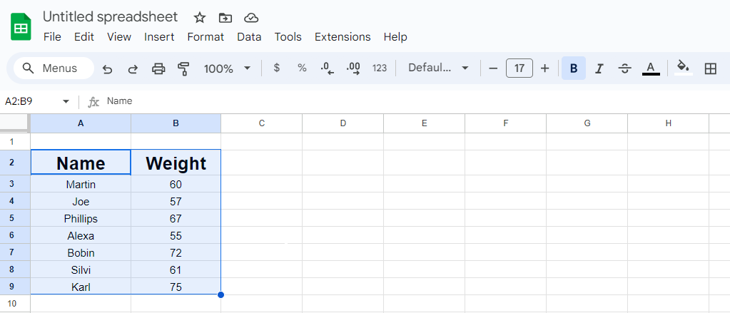
- Open a Google Sheet and select the data for your pie chart. Ensure the data is organized in categories and their corresponding values.
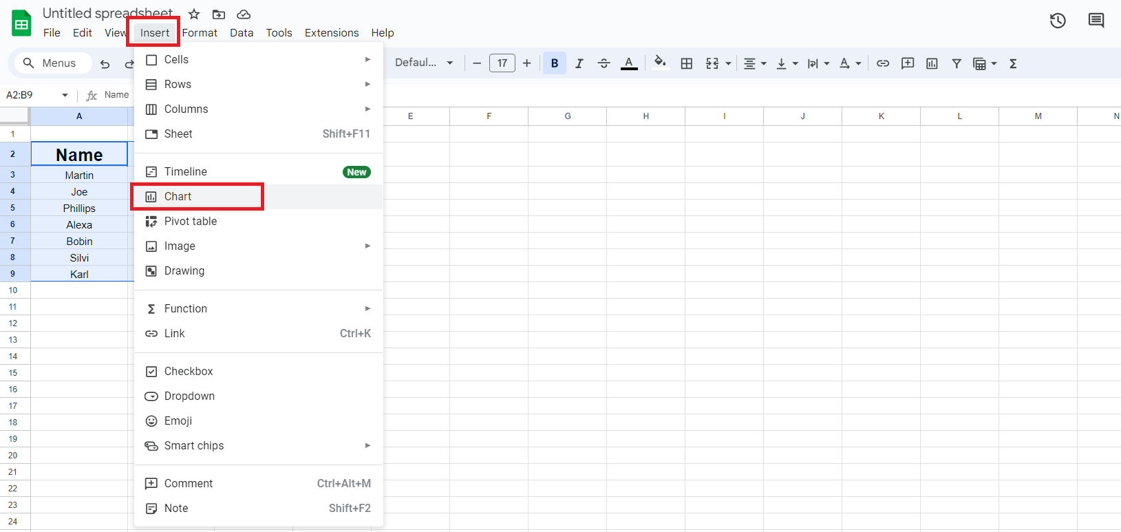
- Click the “Insert” tab in the top menu bar, then select “Chart”.
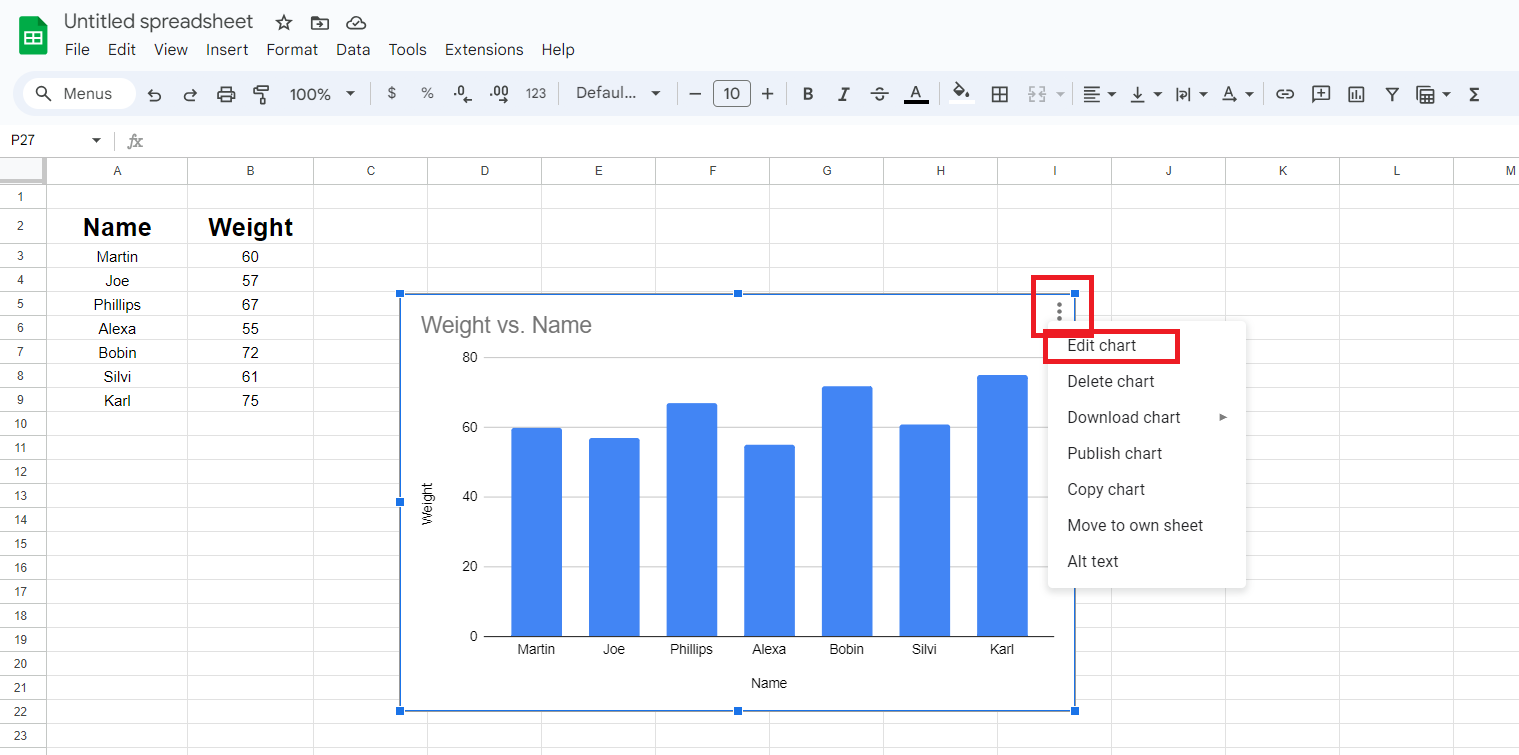
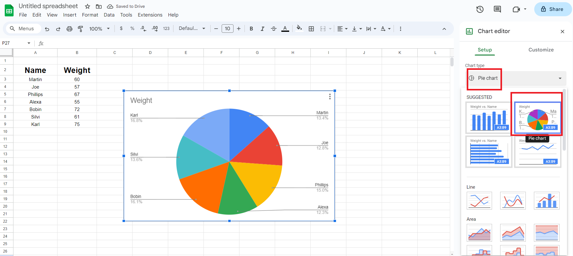
- Mostly, it will automatically generate a pie chart. However, if it creates a graph chart, you can change it by left-clicking on the chart and clicking the ellipsis (three dots) in the top right corner.
- From the drop-down menu, select “Edit chart”.
- Now select “Pie Chart” from the Chart type.
And there you have your data into an amazing diagram! In the following section, I will discuss how to organize and simplify complex data.
Steps to Customize a Pie Chart
Now that you’re done making a pie chart, it’s time to customize pie slice colors, titles, chart styles, and more to make them more appealing and professional.
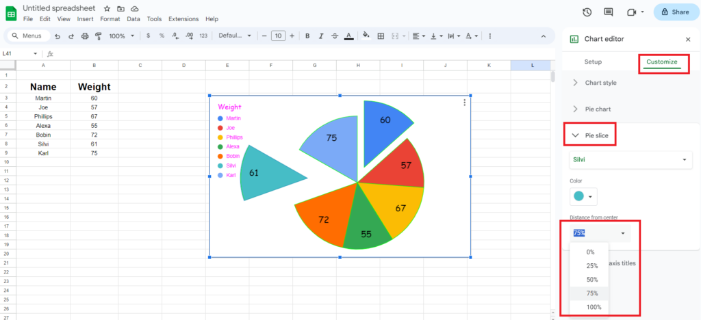
To enjoy this, Go to the “Customize” tab in the top-right corner after you select “Edit chart”. Under this tab, you can find many options to customize your graph.
Let’s quickly delve into how to customize a pie chart in Google Sheets.
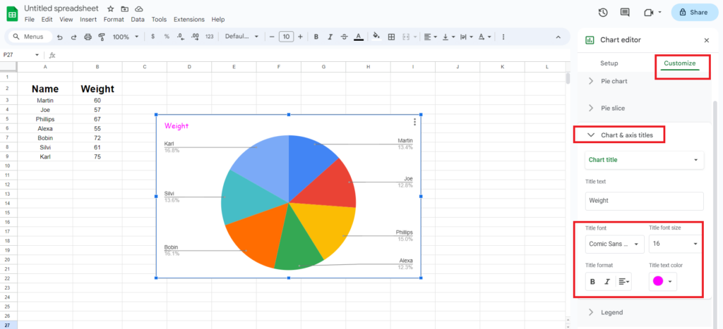
1. Chart and Axis Titles
You can give a Title to your PieChart and customize its font, format, font size, and color by Chart and Axis Titles.
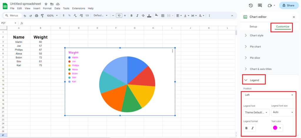
2. Legend
Legend represents the categories that you’ve entered in your data. You can customize its position according to your preference. You can also customize Legend font, size, format, and color.
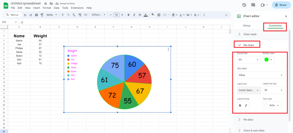
3. Pie Chart
You can easily change the label formats, text color, font size, slice label display, and more.
You can also resize and move your pie chart. Drag the corners to increase the chart size, or drag those inwards to decrease it.
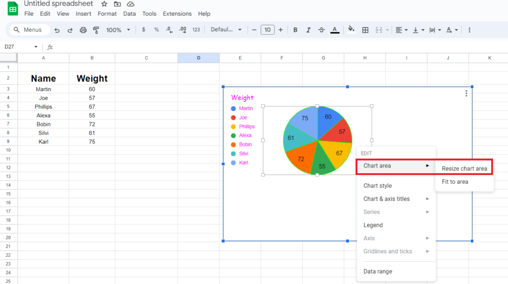
To relocate your pie chart, hold on to the left, click after selecting the chart, and move your mouse in the desired direction.
Creating a Pie Chart with Percentage
The steps are quite similar to previous ones.
- Firstly, make a pie chart as you did earlier.
- Go to “Customize” in the top right corner after you select “Edit Chart”.
- Navigate to “Pie Chart” to open a drop-down menu.
- Go to “Slice label” and choose “Percentage”.
Making a Double Pie Chart
You can prepare a pie chart depicting different ranges in a Google Sheet. The double pie chart will combine two different data sets to create a unified pie chart.
- Select the first data set and create a pie chart as previously discussed.
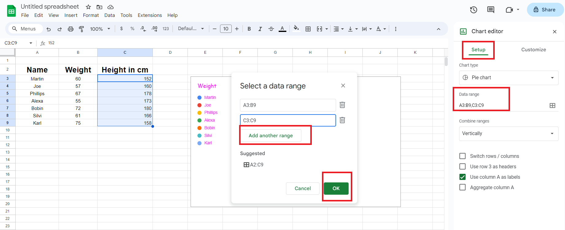
- In the “Setup” tab on the top left corner, go to “Data range”.
- Click “Select data range”, and “add another range”.
- Enter the row and column number of the data you want to represent in the pie chart.
- Click “OK”.
- Now you are back to the main menu.
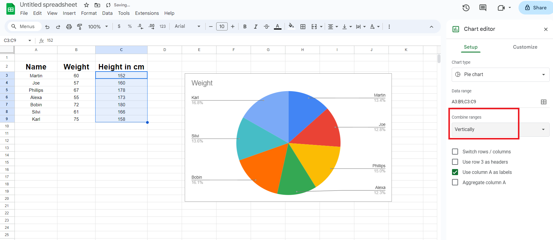
- Go to “Combine Ranges” under the “Data Range” tab.
- Select “Vertically” to display your combined pie charts.
Also learn:
Frequently Asked Questions
Step 1: Select the pie chart and go to “Edit chart”.
Step 2: Go to “Data range”.
Step 3: Change the data range you want to display.
Yes. To change a table to a pie chart, select the table and go to “edit chart”. Now select “pie chart”.
Step 1: Left-click to select the chart and open the “edit chart” sidebar.
Step 2: Click the “Customize” tab and open the pie chart submenu.
Step 3: Change the “Slice label” from percentage to none.
Step 1: Left-click to select the chart and open the “edit chart” sidebar.
Step 2: Click the “Customize” tab and open the pie chart submenu.
Step 3: Change the “Slice label” to labels.
Yes, it’s possible to make 3D pie graphs in Google Sheets. Follow steps:
Step 1: Left-click to select the chart and open the “edit chart” sidebar.
Step 2: Click the “Customize” tab and open the pie chart submenu.
Step 3: Go to “Chart Style” and select 3D.
Yes, it’s possible to do so. Here’s how:
Step 1: Left-click to select the chart and open the “edit chart” sidebar.
Step 2: From the “Setup” tab, go to “Chart type and select the type of chart you want to create.
Wrap Up!
It’s time you utilize the insightful and user-friendly potential of Google Sheets to organize your data in a visually appealing manner. With its customizable features, you can easily create pie charts that effectively communicate complex data.
So, be prepared to jazz your next presentation with pie charts and see how it amazes your audience.
Leave a Reply